Plymouth International Hotel – Illuminated Signs
Plymouth-International-Halo-Channel-Letters
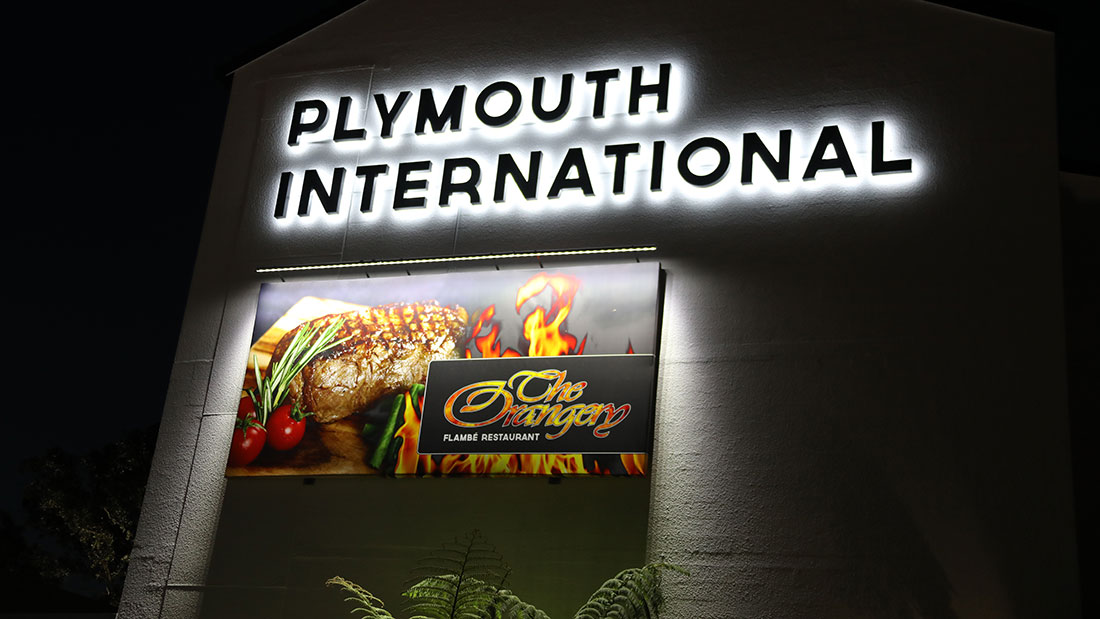
Acrylic-LED-Letters-Fabrication
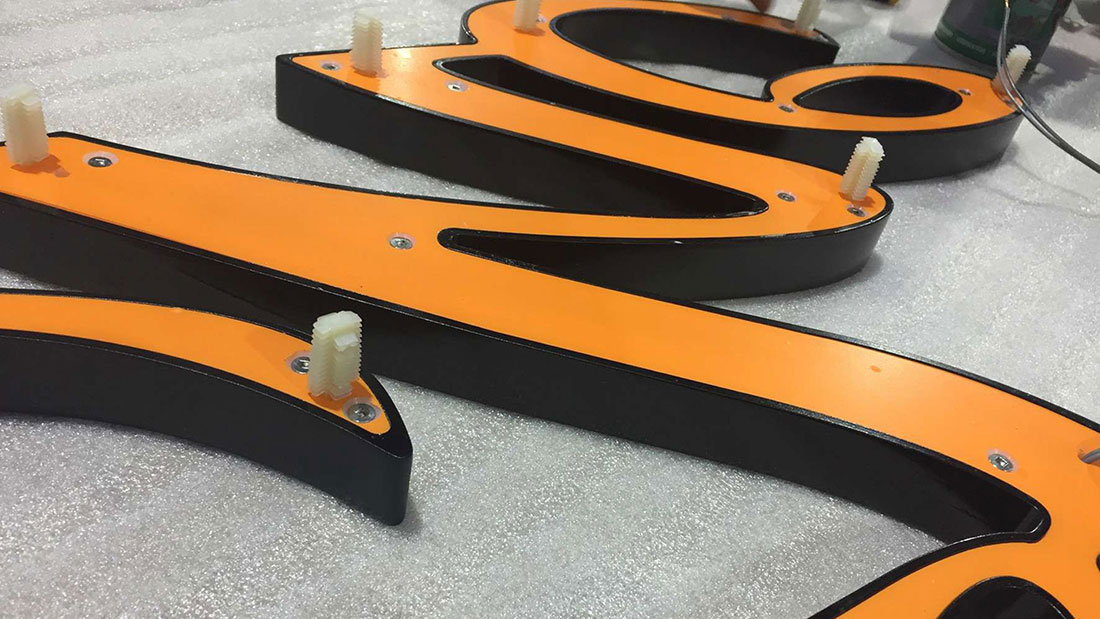
The-Orangery-3D-Signage
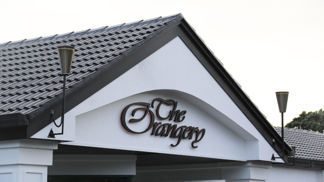
The-Orangery-Lightbox-Cabinet-Sign
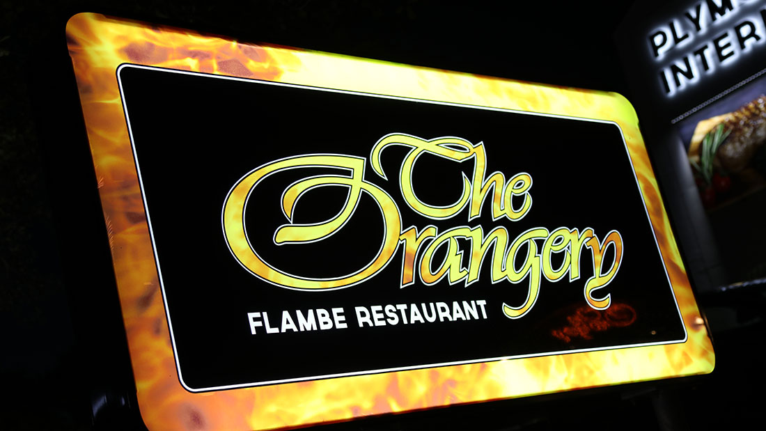
The-Orangery-Illuminated-Entrance-Sign

Halo-Illuminated-Acrylic-Letters
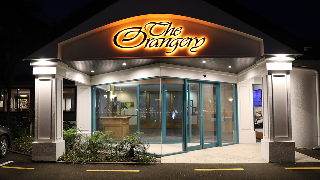
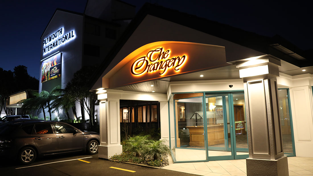
LED-Illuminated-Building-Signage
About This Project
With growing competition in the local market, and risk of losing market share, Plymouth International wanted to raise their profile, improve visibility and promote their fine dining restaurant, The Orangery.
The exterior of the hotel was being painted at the time we first met the client on site to discuss the facelift of the brand. The new white colour scheme gave a fresh canvas to work with and an old neon sign that had not worked for many years gave us a good starting point for fixing and electrical.
Our graphic design team provided a few design options to the client and before long manufacture was underway.
The result is a fresh new look with branding that works for them 24/7.
Sign methodology used in this project:
- Halo effect illuminated channel letters (Plymouth International)
- Halo effect machined acrylic letters (The Orangery)
- Billboard frame and skins with LED Billboard lighting system.
- Aluminium Fabricated Lightbox with UV printed polycarbonate panels.
Custom Field
Lorem ipsum dolor sit amet
Date
20 November


