Prospero Place – Wayfinding
Custom Field
Lorem ipsum dolor sit amet
Date
20 November
Category
Display, SignsAbout This Project
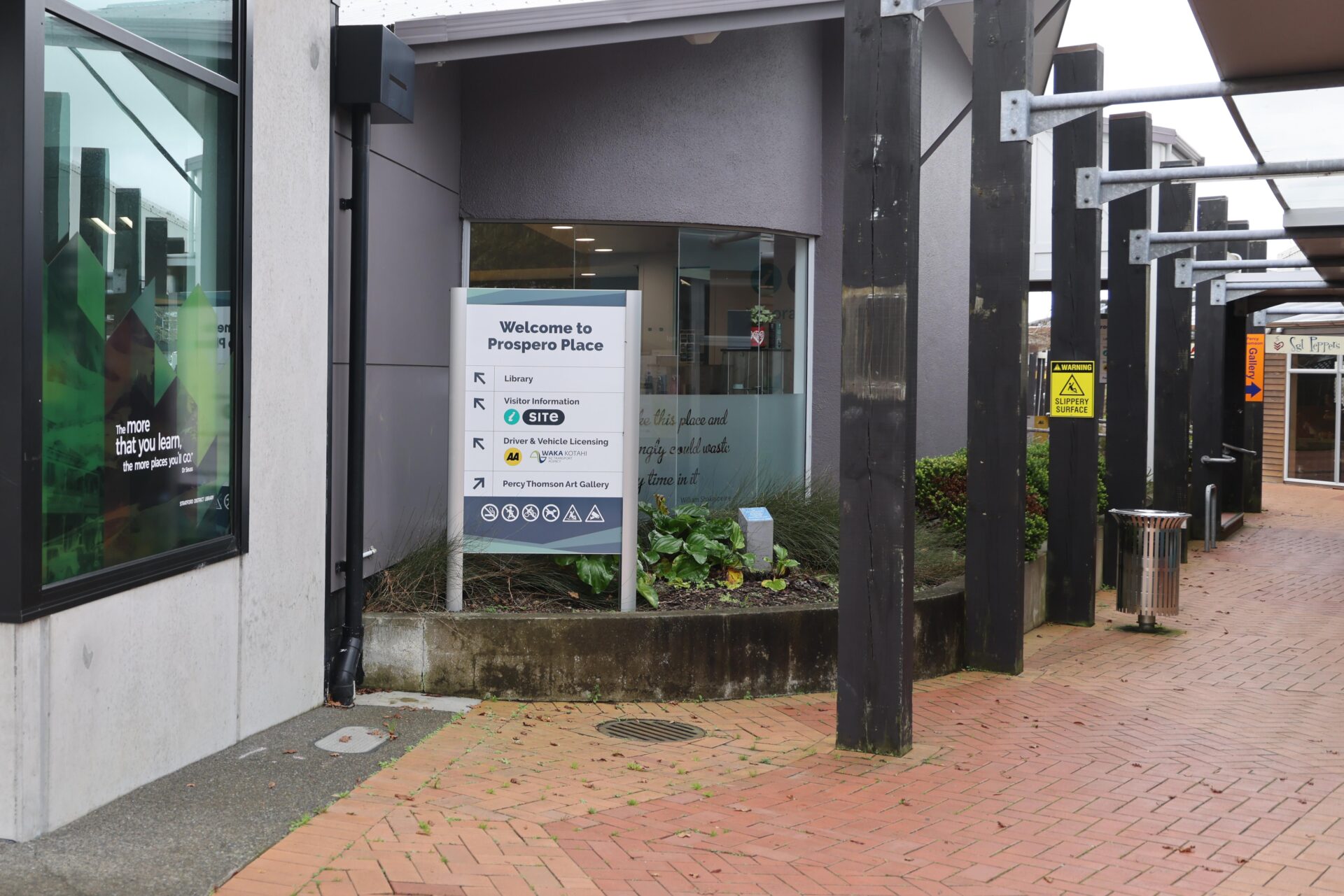
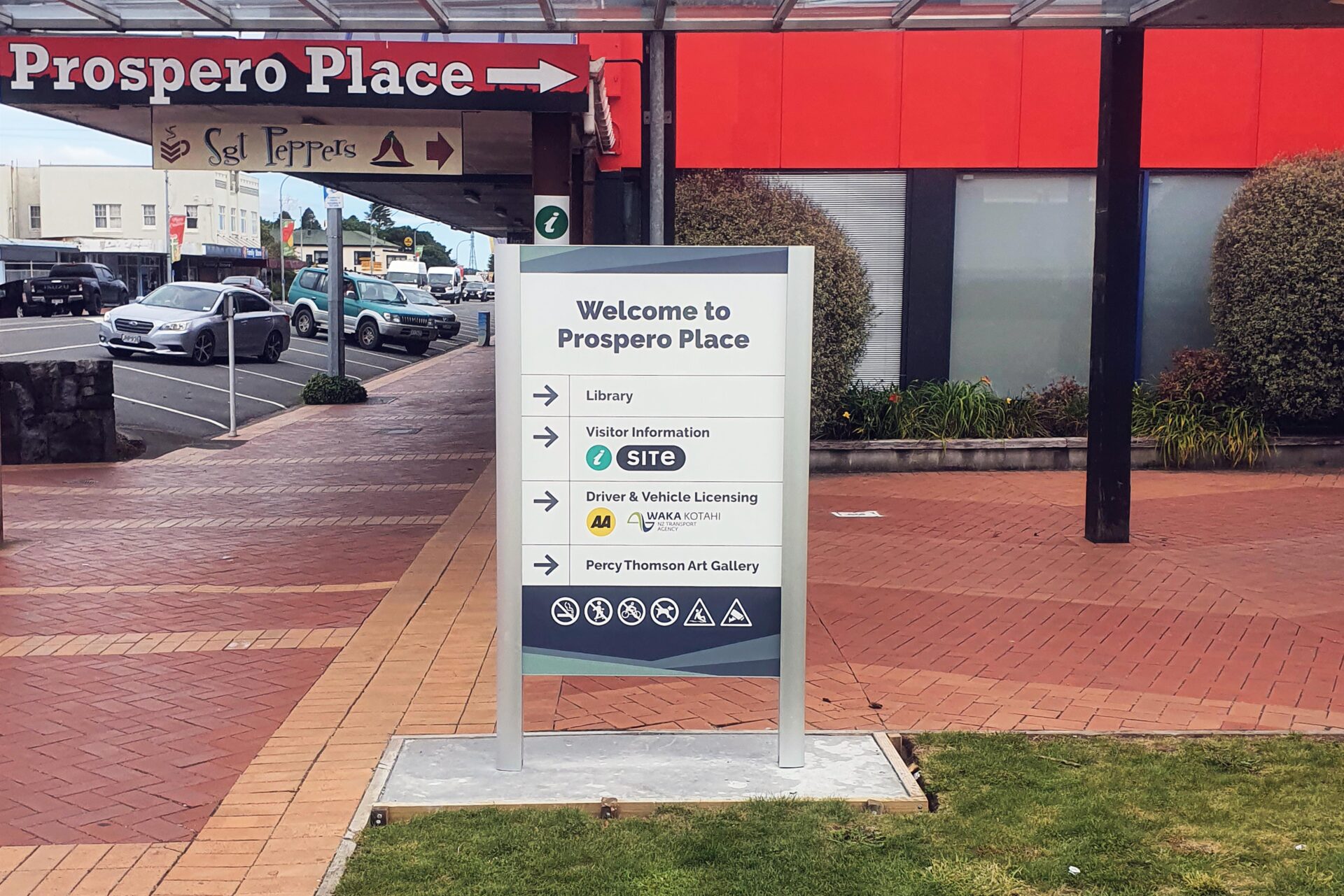
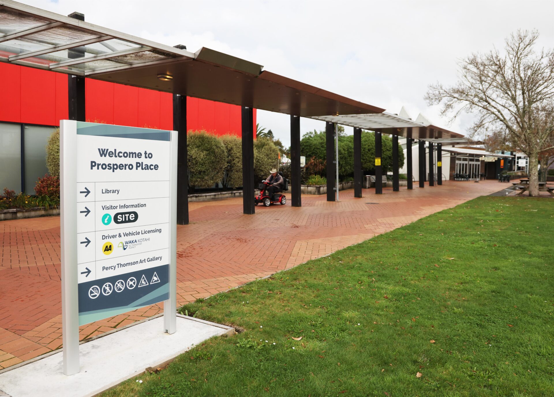
Prospero Place is a busy pedestrian hub that had become visually chaotic. Each business had installed their own signs in an attempt to stand out, resulting in a cluttered and confusing environment.
While visiting a client onsite, I couldn’t help but notice how overwhelming the signage had become. So I took a few photos and mocked up a concept that showed the council a side-by-side comparison—what it looked like now versus what it could look like. My plan removed 12 signs and replaced them with just 3 well-designed, thoughtfully placed ones.
A few weeks later, I got an email. They liked the initiative, appreciated the proposed solution, and gave the green light. From there, things moved quickly.
Because the site already had a strong brand style, we worked closely with the council’s graphic designer. We sent over our artwork files, and they made a few minor adjustments—mostly to colours and fonts – to align everything with their existing theme.
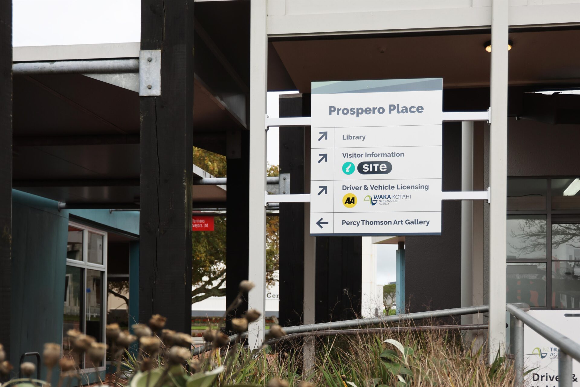
For the new signs, we used the Navigator Sign Post system at both entranceways. Near the library, we custom-built an aluminium frame to span two existing poles, creating a clean focal point that anchors the space.
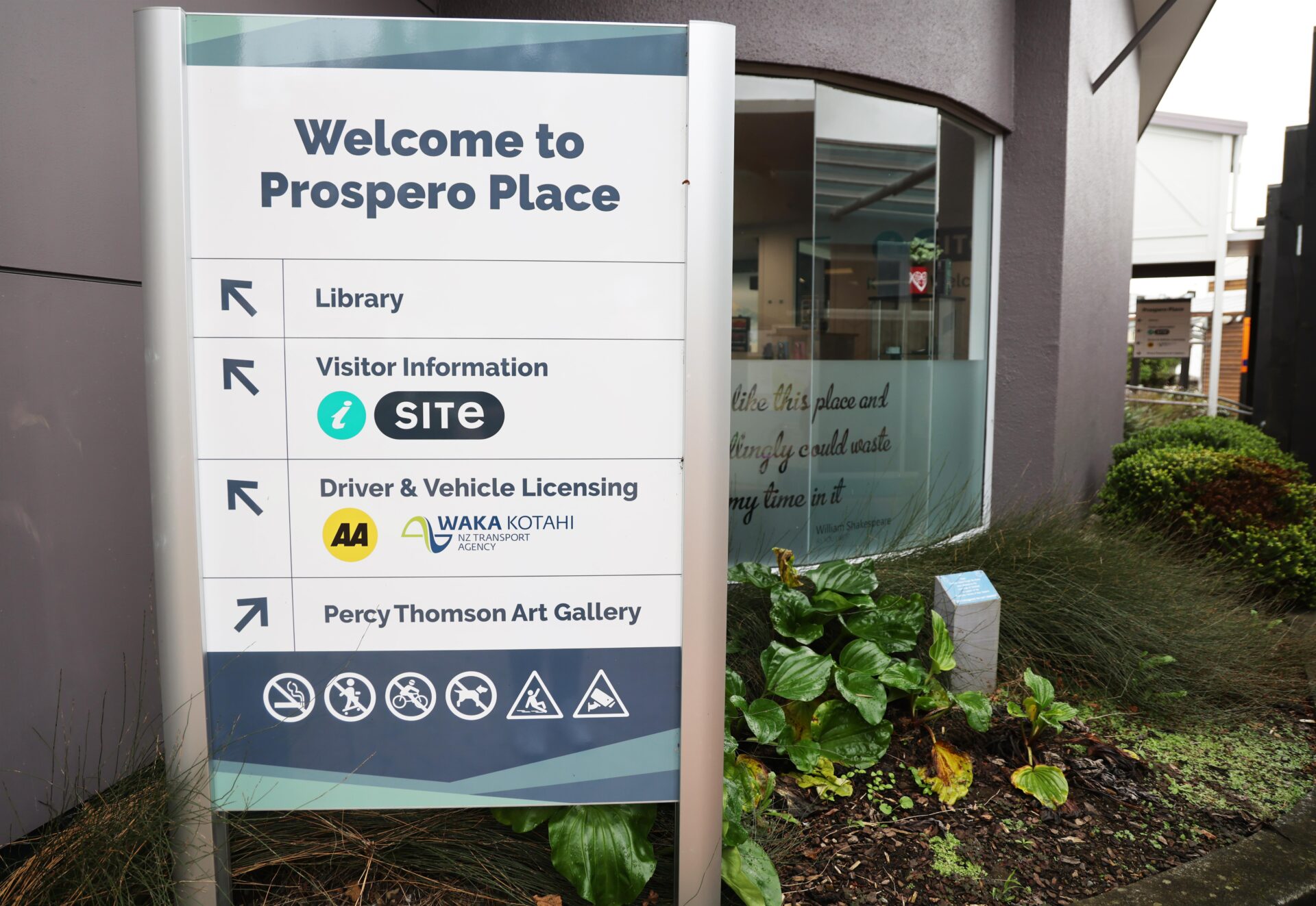
All sign panels were made from 4mm ACM and finished with cast printed vinyl graphics. We powder-coated the custom frame white and used VHB tape and glue to mount the ACM panels securely and seamlessly.
The final result is clear, professional, and easy to follow. Visitors can now find their way around easily, and the overall look of the space is modern and clutter-free. A great result from a simple idea.