S @ Spark Arena – Ceiling Lightboxes
Custom-Cut-&-Replace-Lightbox
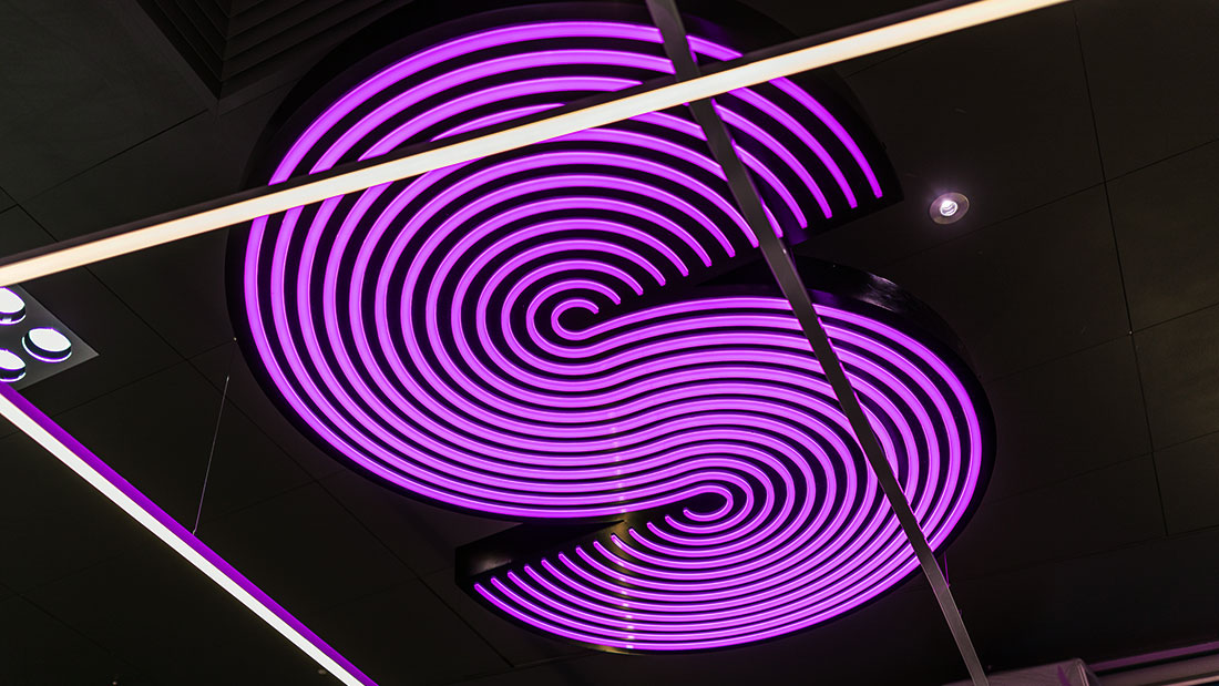
Neon-Alternative-Fabricated-Sign
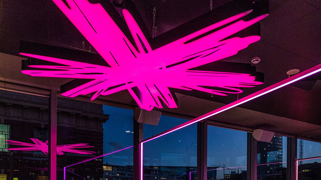
RGB-LED-Ceiling-Feature-Sign
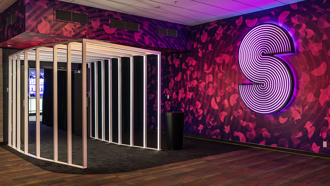
Spark-Arena-S-Bar-Entrance-Sign
Custom-Chandelier-LED-Feature
S-Bar-RGB-LED-Signage
About This Project
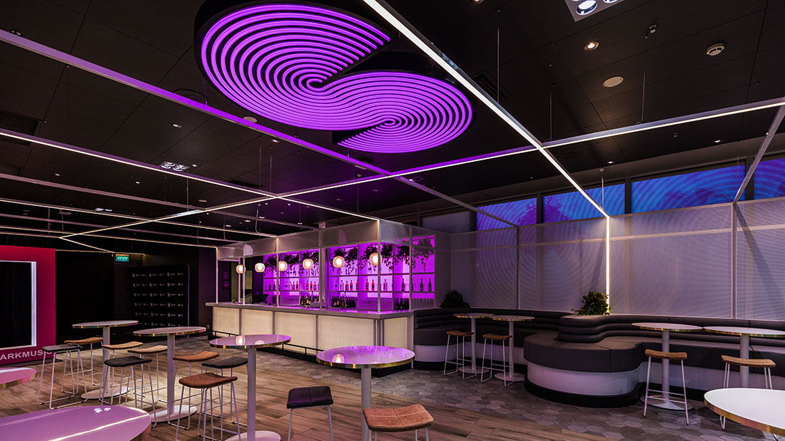
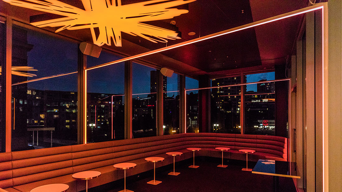
The brief was to take the ‘S’ and ‘Spark’ logo’s and transform them into something beautiful and bright to enhance the space, kind of a modern take on a chandelier. Another challenging project for our team to get their teeth into!
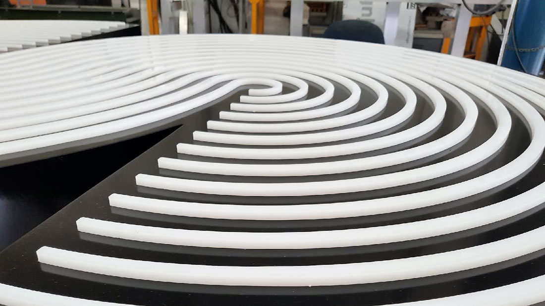
The ‘S’ Lightbox needed to look like Neon, but not have the same risk of broken glass. We used a cut and replace technique to push through thick Opal acrylic and create a 3-dimentional effect that will light up like Neon. The sign case was fabricated from aluminium and the illumination comes from some punchy RGB LED lights and a cleaver controller. 2 different backs were created, one that we could wall mount, and one to hang from the ceiling.
The ‘Spark’ lightbox was challenging because of the shape. This was cnc machined from layered acrylic, and then filled with LED’s light the S sign. A steel frame supports the back of the sign and has the mounting mounts to suspend to the ceiling.
This is one of the most exciting projects we have been involved in, working at a venue like Spark Arena. We love collaborating with other creatives, and this project was no different. This funky space was design by renowned interior designer Paul Izzard and we had the privilege of working with fellow sign makers Write On Signwriters and Pete Signs.
Custom Field
Lorem ipsum dolor sit amet
Date
20 November


