OMV – Corporate Office Signage
ACM Plinth Sign
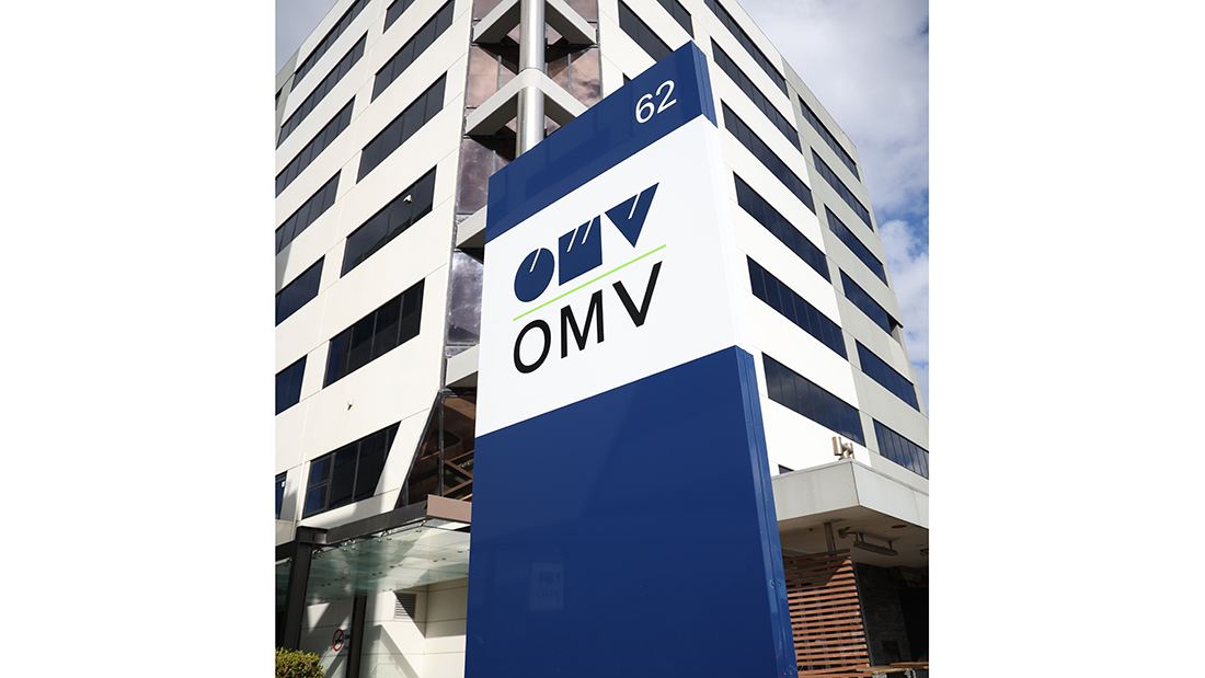
OMV Office Entrance signage
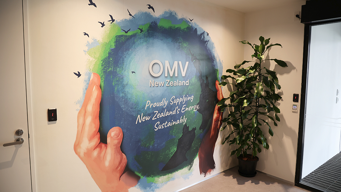
OMV printed wallpaper mural
013A8256
Board room feature wall
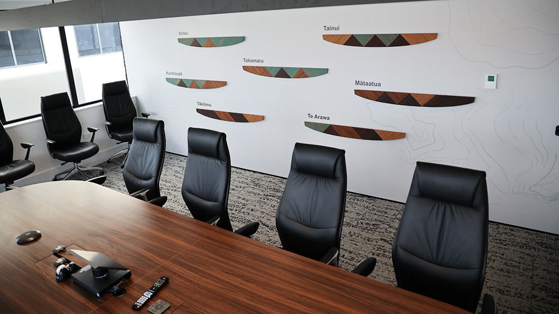
Board room feature wall close up
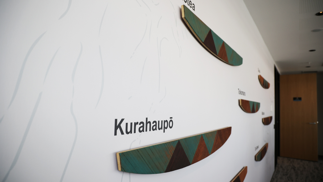
Office partition frosted graphics
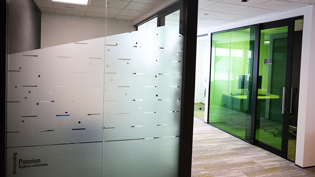
Vinyl Wall Quote

Birch Ply Artwork Routered panels close up
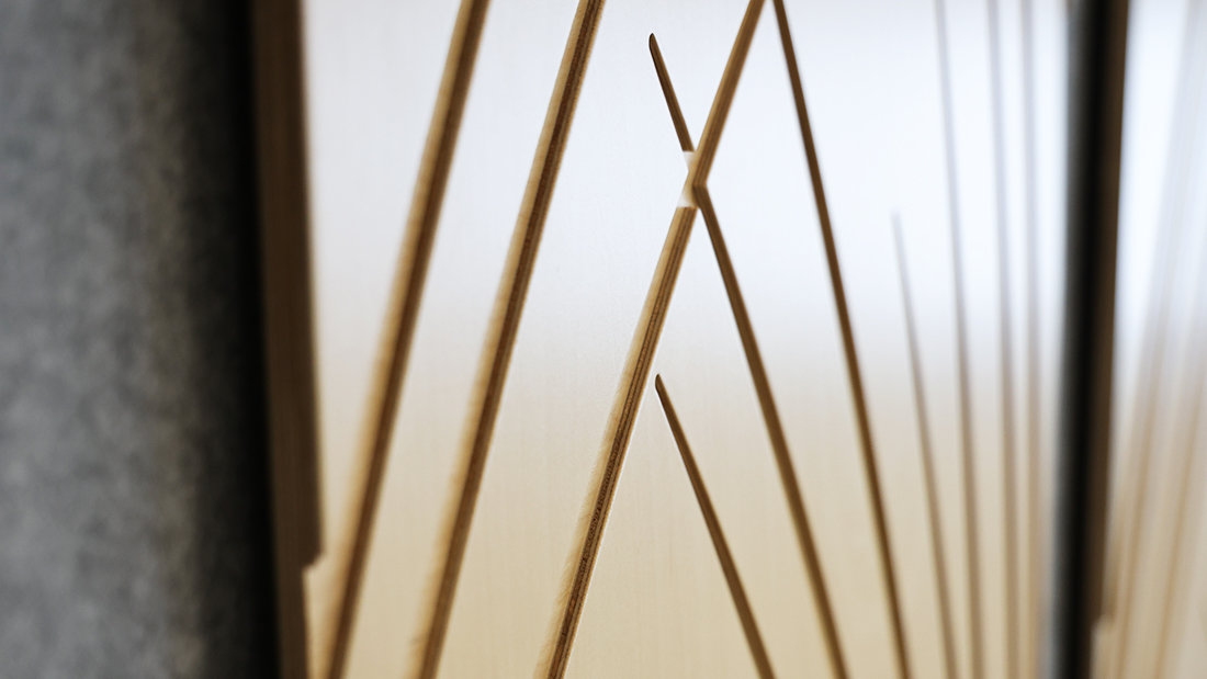
Birch Ply Artwork Routered panels
Laser Cut Acrylic feature wall sign
Acrylic door signs

3D acrylic reception sign
ACM Pillar Wrap directory sign

Creative glazing manifestation markings
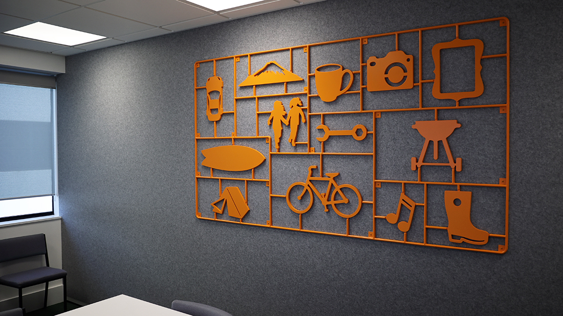
3D model kit feature artwork
3D model kit close up router detail

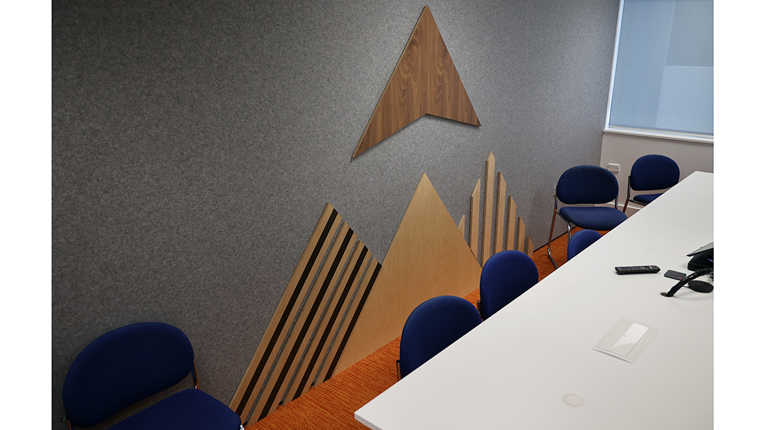
Plywood mountain artwork
Hexis Cristal coloured glazing film
About This Project
We were thrilled to work on this project alongside the talented team at Smokeylemon.
Smokeylemon developed OMV’s 7 brand values into graphic themes, and designed a layered earth diagram representing the 7 floors of their new office building.
OMV wanted creative ways to produce the values and floor indicator graphics throughout the building. Innovative materials and cost-effective solutions were a must on this project.
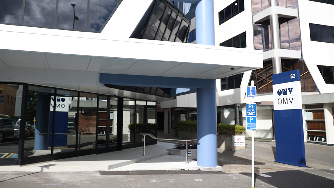
Exterior: OMV wanted to keep a low profile with minimal exterior signage. The building has only a subtle OMV decal placed on the glazing beside the main entrance and a simple plinth sign featuring the logo and street number, The sign is wrapped in ACM with vinyl cad cut graphics. Colour matched Jointer strips and screws conceal edges and allow for easily repairs/panel replacement if required.
Interior: On the ground floor we designed a sign from ACM that wraps around a concrete pillar. The sign is covered in a digitally printed matt laminated film and fixes to an aluminium frame which sits behind the sign allowing cables to run behind the sign to the workstations below.
Behind this sign on the reception wall we have installed a logo cut from 20mm acrylic and painted in a satin finish. Rebated Christmas tree mounts ensure the sign sits off the wall enough to be effective but not so much that people will get caught on it walking past. The logo is framed with moss wall planters to bring some colour to the space.
The staff entrance on the ground floor features an illustration also created by Smokey Lemon. The artwork was surrounded by textured walls. We printed the artwork on a matt wallpaper stock which we then coated with a matt clear coat to helps the art look tie into it’s surroundings.
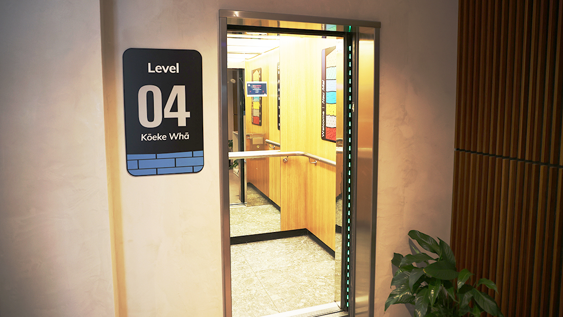
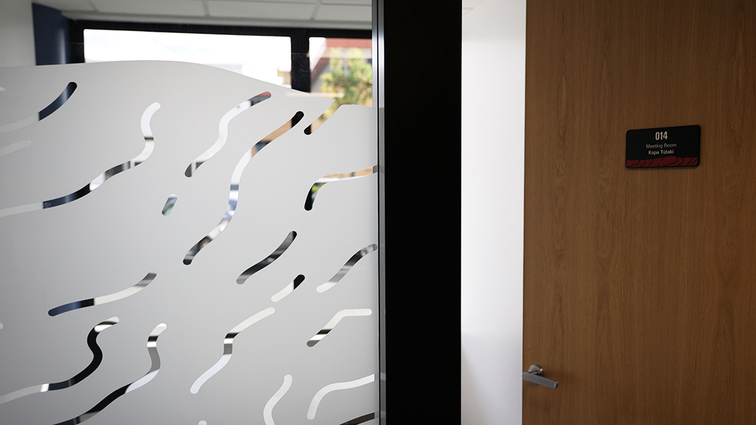
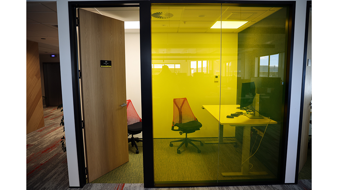
The pattern from each layer of the earth diagram is used to create manifestation markings through the office windows on each floor. The client wanted their bookable offices to be open but also easily identifiable. We used Hexis cristal film allowing the glass in these rooms to be coloured yet completely transparent. The lift signs, door signs and level indicators are made from black laser cut acrylic with a digitally printed film and matt laminate.
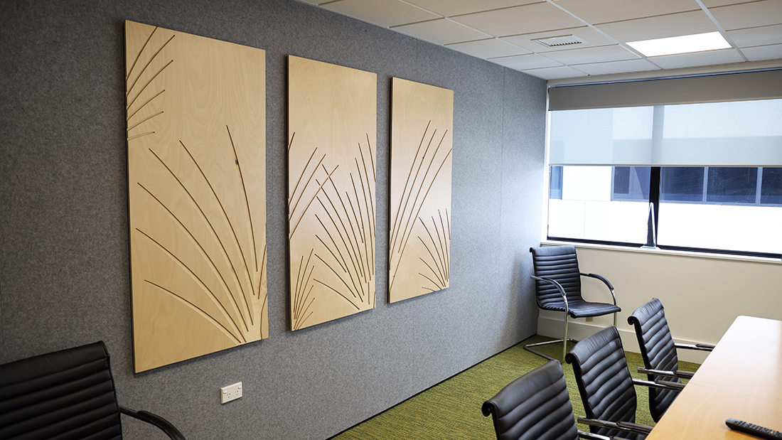
Each floor has a boardroom where we had to create a piece of artwork using the graphic themes developed from their 7 company values. I have shown 4 of these pieces. The spinifex artwork is cnc routered from birch plywood, sanded and clear-coated and hung on the wall with MDF split rails.
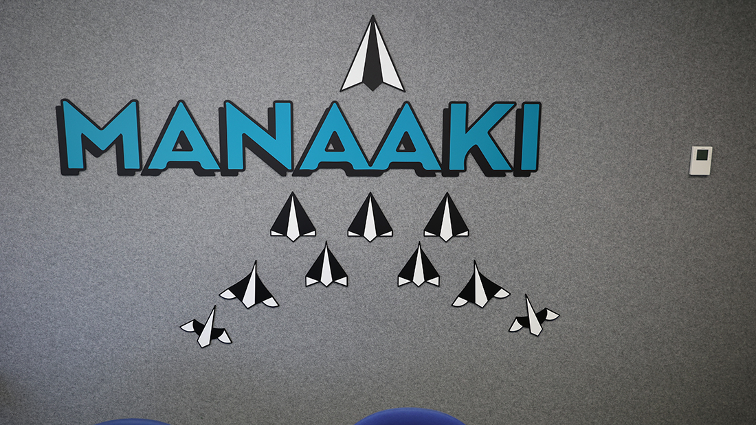
The model kit has a bottom layer cut from aluminium with tabs which are used to fix the artwork to the wall with colour matched screws. The top layer is cnc routered using different tooling to create a round look for the frame with little snap-off pieces between the different shapes. Both layers are bonded with mounting adhesive and then painted in a semi-gloss finish to give a plastic model kit look.
The mountain peaks and made from different types of plywood coated in different products for contrast. These panels are biscuit joined to each other to ensure all the pieces line up. They have rebated letter mounts which attach through the acoustic panel and fix securely to the wall behind.
The waka wall displays the 7 waka that first voyaged to Aotearoa. The wakas were designed and made by an artist and we completed the vinyl wall graphics and installation.
Everything was produced in-house and installed by our team.
This was a fantastic project and a beautiful representation of the clients brand.
Custom Field
Lorem ipsum dolor sit amet
Date
20 November


