BTW Company – An Architectural Sign Solution
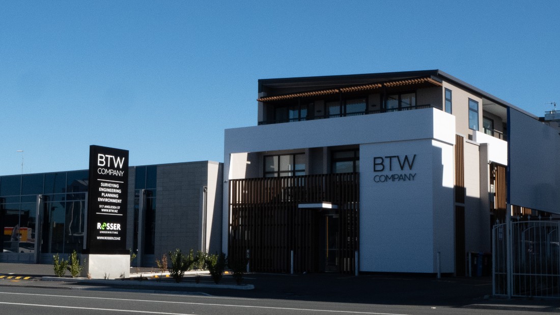
BTW Building and Plinth Sign
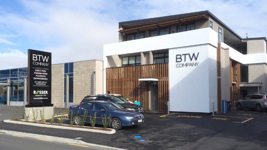
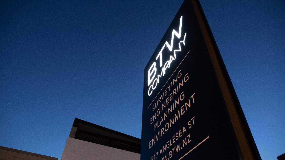
BTW Company Hamilton Office at Night
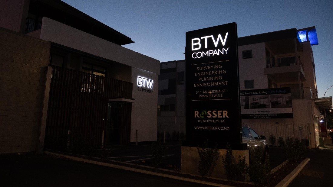
BTW Company Hamilton Office
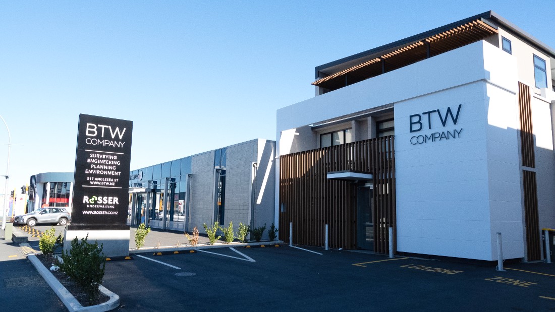
BTW Hamilton Signs
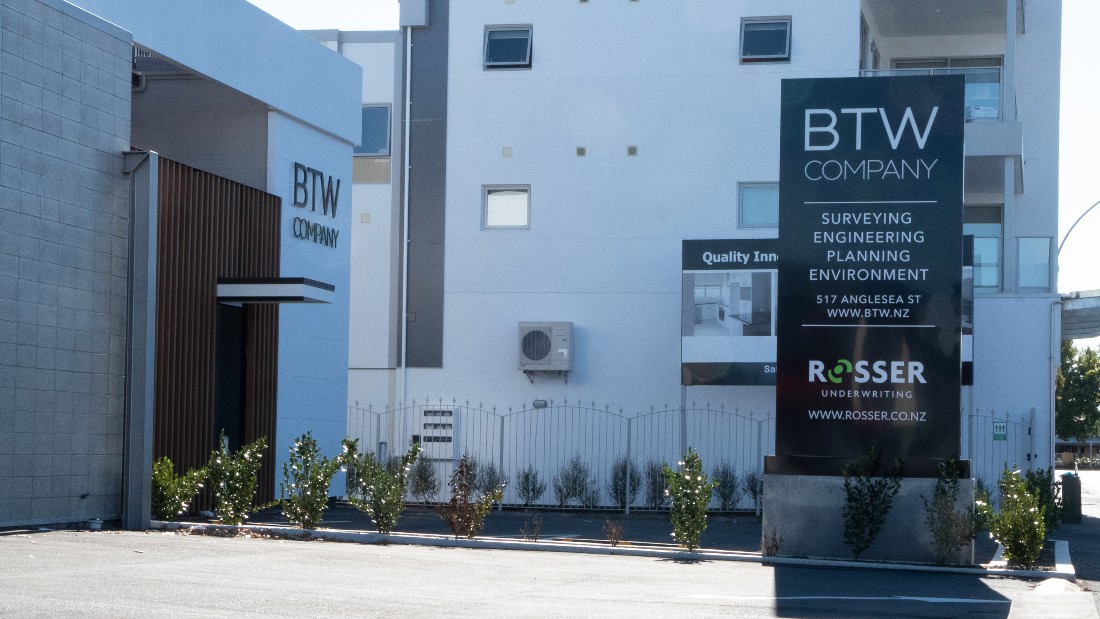
BTW Plinth and Building Sign at Dusk
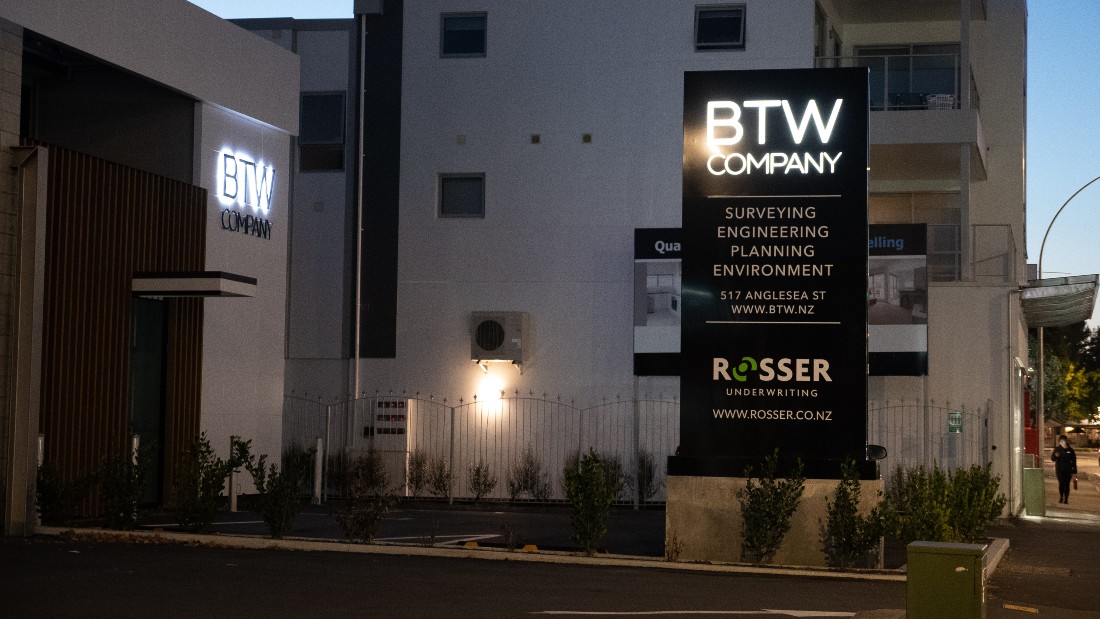
BTW Plinth and Building Sign Illuminated

BTW Plinth and Building Sign
BTW Plinth Sign Close up Foot Detail

BTW Plinth Sign Night
BTW Plinth Sign with Cedar Negative Detail

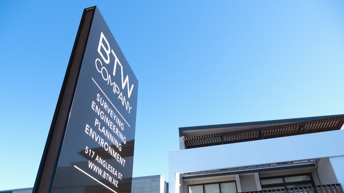
BTW Plinth Sign
About This Project
BTW Company were renovating their Hamilton office and wanted some signage that was complimentary to the new architectural elements of their building. The building was set back off the road slightly, so a plinth sign seemed like the most appropriate type of sign for the space.
They wanted the sign on a raised concrete plinth which we agreed was a great idea, as it meant that cars wouldn’t accidentally damage it when parking.
We took inspiration from the engineered timber on the building and designed a cedar negative detail element running the entire height of the sign on both sides. To keep the look clean, we hit the fastenings with a matching foot plate cover. To ensure maximum return on their investment we lit up the Logo with some low energy LED”s and got the sign working for them 24/7.
We also cut Solid acrylic letters, painted them black and created an illuminated halo sign on the blank space of the building.
Logo and graphic design Work by Jennie at Hall of Design
Custom Field
Lorem ipsum dolor sit amet
Date
20 November


