NPGHS – where’s the office?
NPGHS Wayfinding Overview
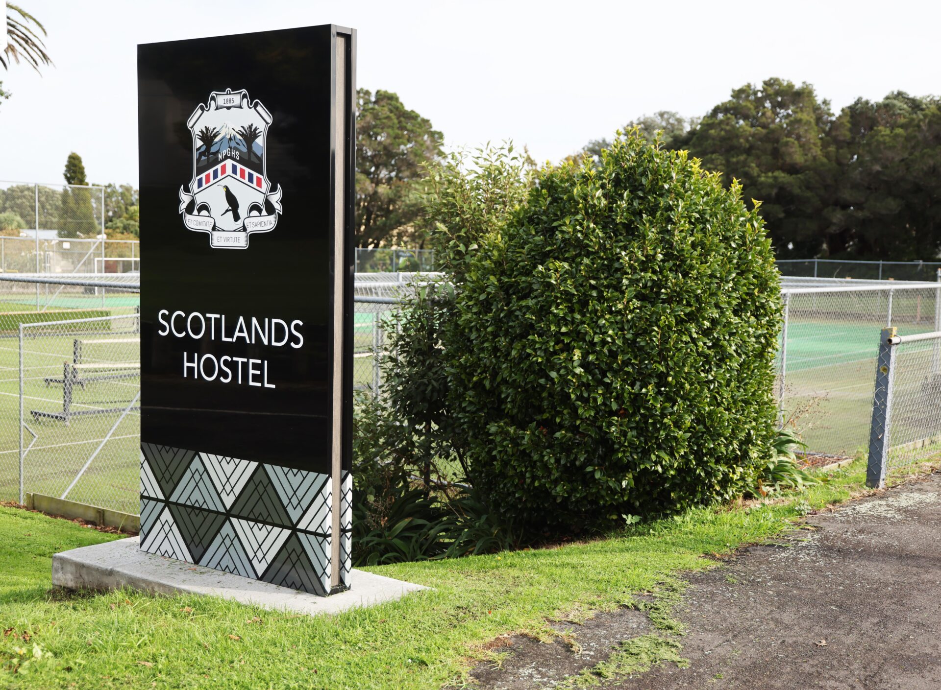
NPGHS Scotlands Hostel
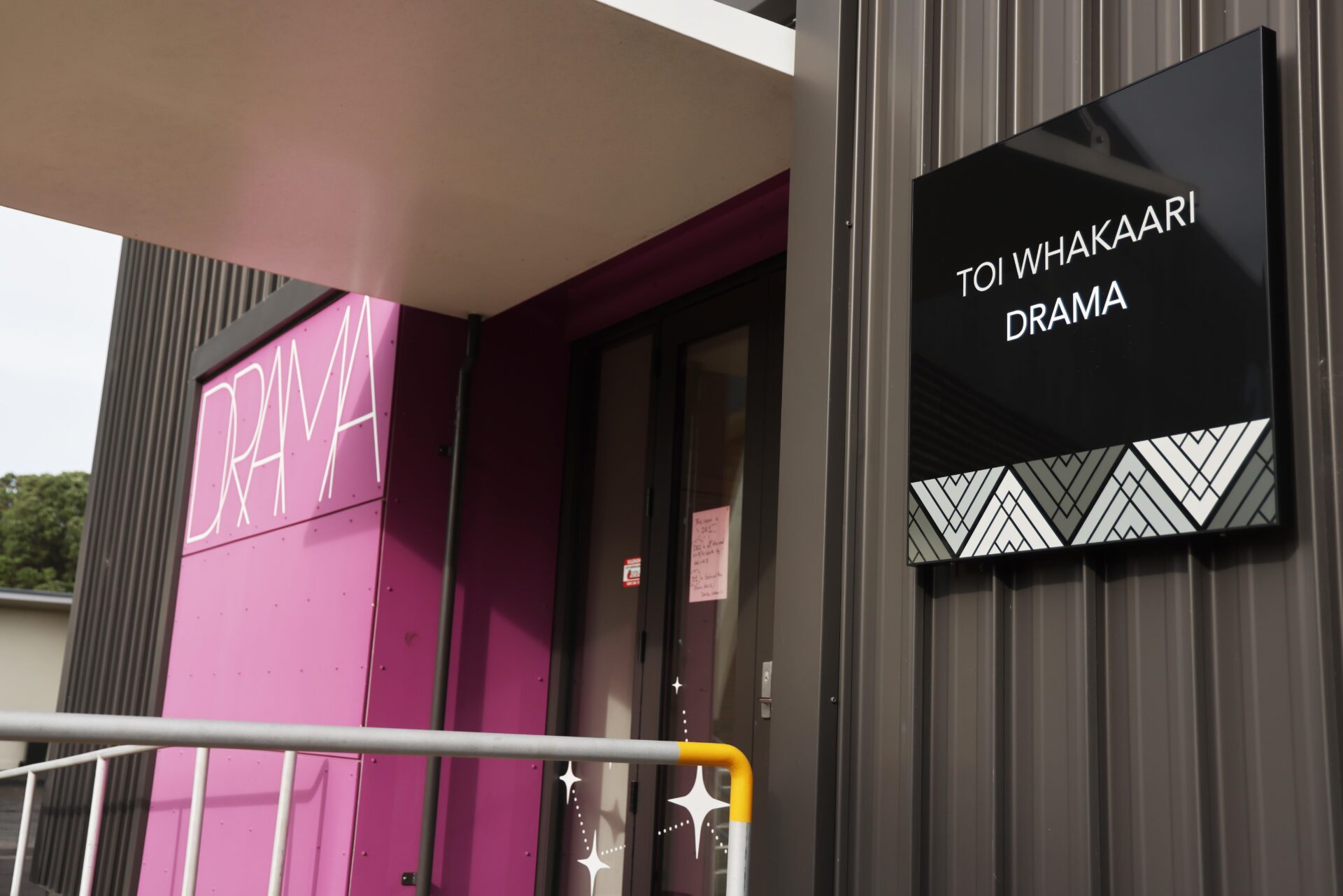
NPGHS Drama
NPGHS Hall
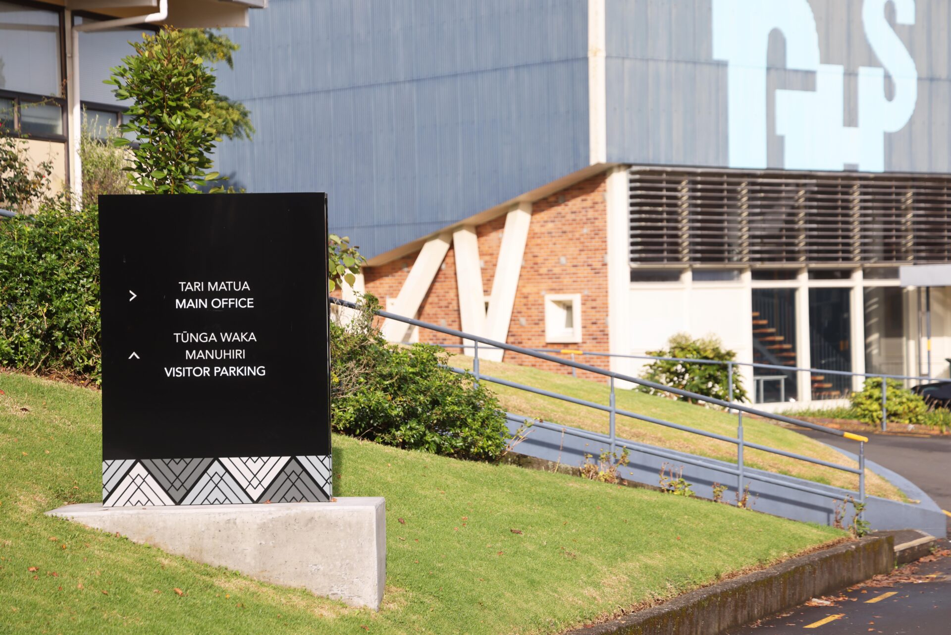
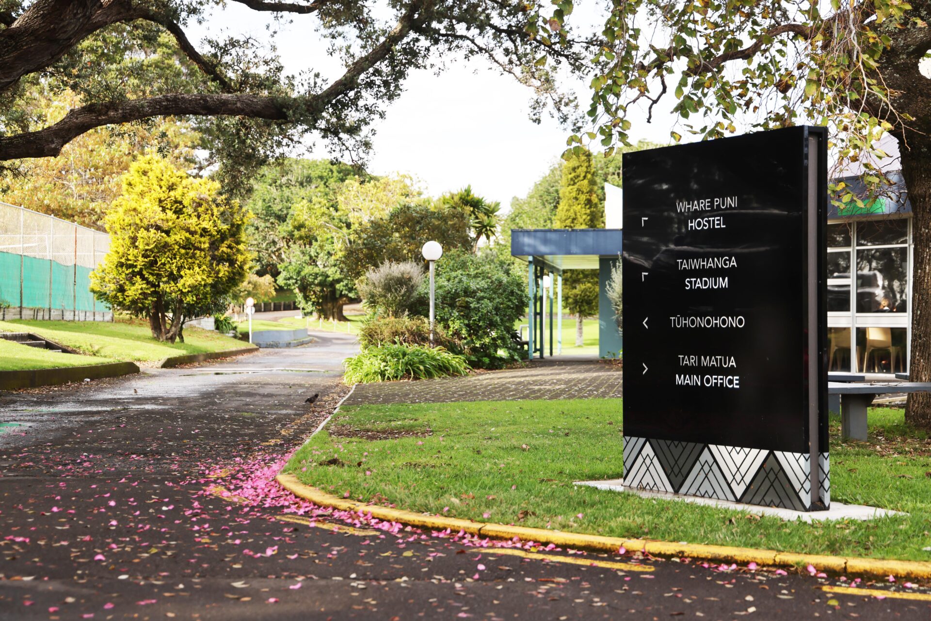
NPGHS Directional
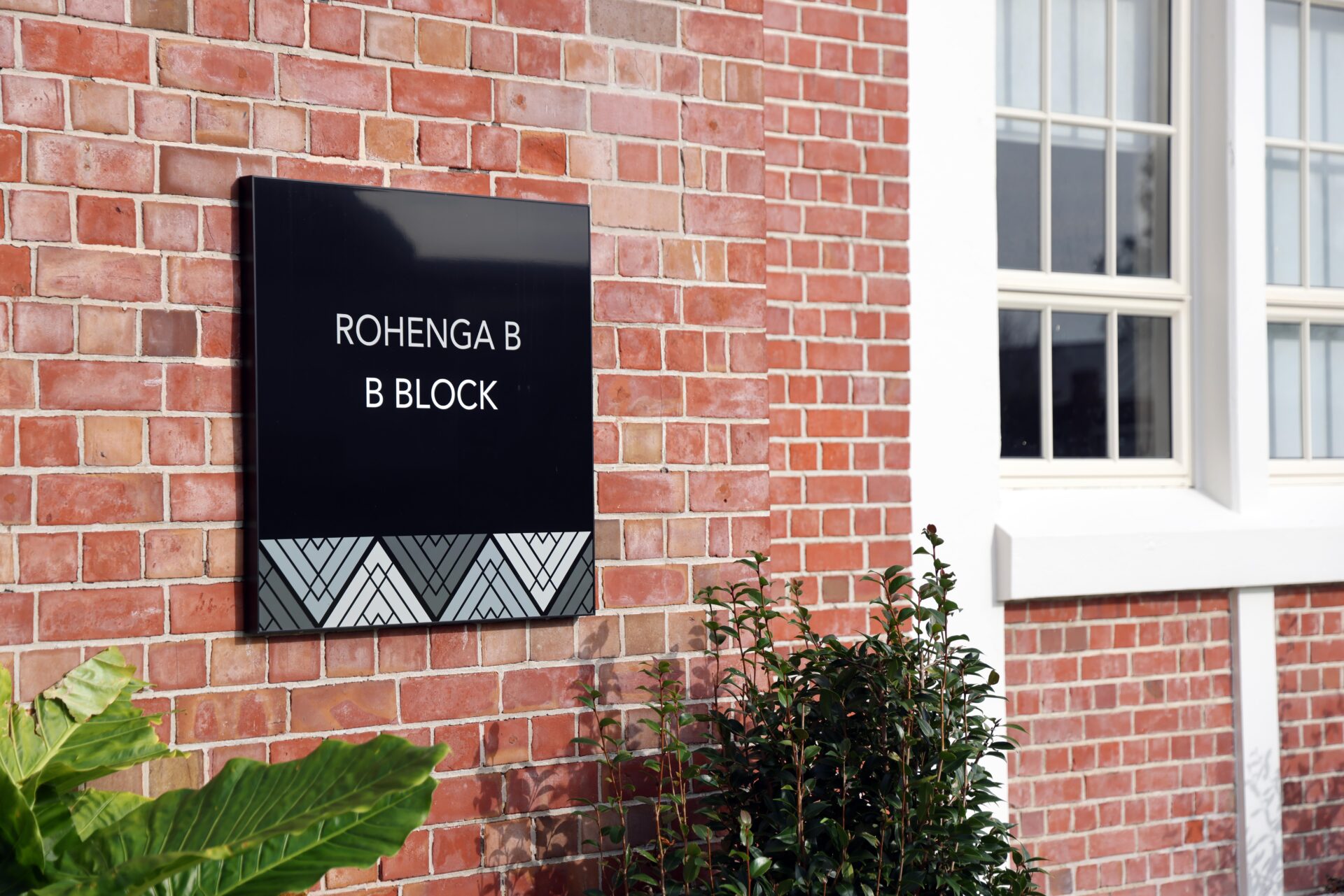
NPGHS B Block Wall Sign
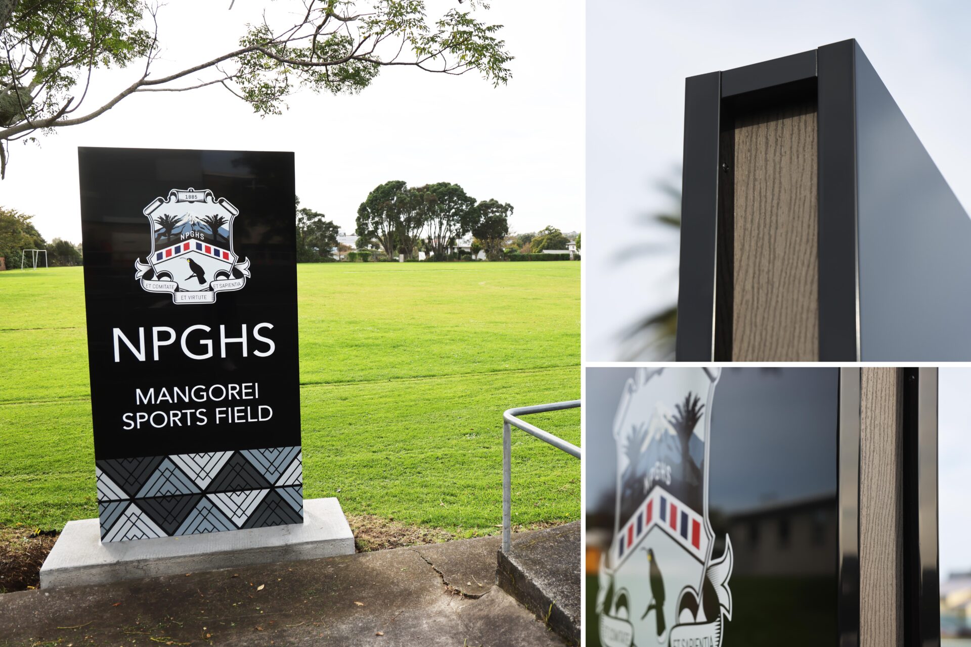
NPGHS Sports Field
About This Project
New Plymouth Girls’ High School (NPGHS) reached out to us with a clear issue – visitors couldn’t find the main office. What started as a simple sign request quickly turned into a full-scale wayfinding signage solution for the entire school.
We were brought in after a strong recommendation from an architect we’d previously worked with. The school’s graphic designer partnered with us to develop signage that not only helped with navigation but also reflected NPGHS’s identity and values.
A Clear Brief
NPGHS needed signs that were long-lasting, easy to follow, and visually distinct from their varied buildings and landscaping. They also wanted the new wayfinding signage to include:
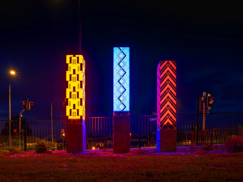
- A bold black colour for contrast
- Their poutama pattern, created with local iwi
- A timber element that was attractive but low maintenance
Our Four-Part Signage System
We developed a solution using durable materials and consistent design language across four sign types:
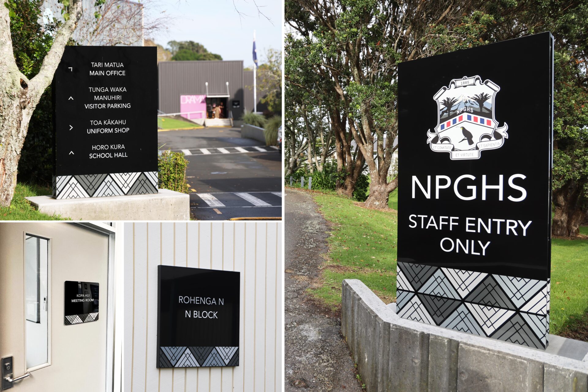
1. Secondary Entrance Signs
We created entrance signs for all four access points using galvanised steel frames, black FEVE-coated ACM panels, and vinyl graphics. Each sign features a charcoal Futurewood strip to give the appearance of timber without the upkeep. The result: entrances that are clearly marked and welcoming.
2. Directory Signs
Seven key intersections on the campus now have smaller, matching signs to direct foot traffic. These signs are consistent in style and help visitors move confidently through the school.
3. Building Name Signs
To make building identification easy, we designed wall-mounted signs using the same ACM and graphics. They’re installed in custom frames that hide fixings and allow for easy relocation in the future—ideal for a growing school.
4. Office Door Signs
For internal signage, we supplied acrylic nameplates with removable backing plates. Office staff can easily update or move these signs as roles change.
More Than Just Signage
Effective wayfinding is about more than directions. It’s about reducing confusion and building confidence in your journey. Every sign we installed reinforces that sense of clarity, while also supporting the school’s commitment to te reo Māori and tikanga Māori.
Client Feedback
“Students, staff, and visitors have all commented on the clarity and look of the signs. They do more than guide—they represent our values. We had a vision but didn’t know how to bring it to life. Logan and the team nailed it. We love our signs—and now people can find the office!”
This project won a BRONZE MEDAL at the 2023 New Zealand Sign & Display Awards in the Wayfinding and Navigation category.

Custom Field
Lorem ipsum dolor sit amet
Date
20 November