Equippers – A Bold Church in an Unlikely Space
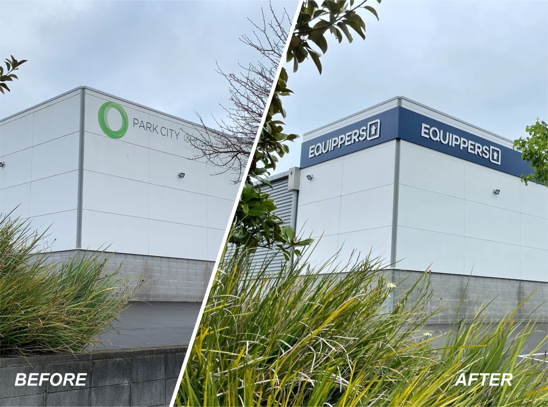
Equippers BEFORE-AFTER
Blue ACM cladding with white foam PVC lettering at Equippers
Blue ACM cladding with white foam PVC lettering at Equippers
Blue ACM cladding with white foam PVC lettering at Equippers
Illuminated channel letter sign visible from New Plymouth motorway
3D logo sign at Equippers church entrance
signage for churches
Illuminated channel letter sign visible from New Plymouth motorway
Illuminated channel letter sign visible from New Plymouth motorway
Illuminated channel letter sign visible from New Plymouth motorway
Illuminated channel letter sign visible from New Plymouth motorway
About This Project
Equippers New Plymouth came to us with a bold vision. They had taken over a large commercial building in an industrial area, and they wanted to transform it into a modern, welcoming church that reflected the well-known Equippers brand.
Although the building sat in a low-traffic area, its rear wall faced a busy highway. They needed strong branding that stood out both up close and from a distance.
The Brief and the Challenge
As part of the global Equippers network—39 churches across 11 countries—this site needed to feel instantly recognisable and on-brand. But the building had no charm, no curb appeal, and was surrounded by standard commercial signage.
Our client had a limited budget, so we prioritised three key signage features that would deliver the most impact.
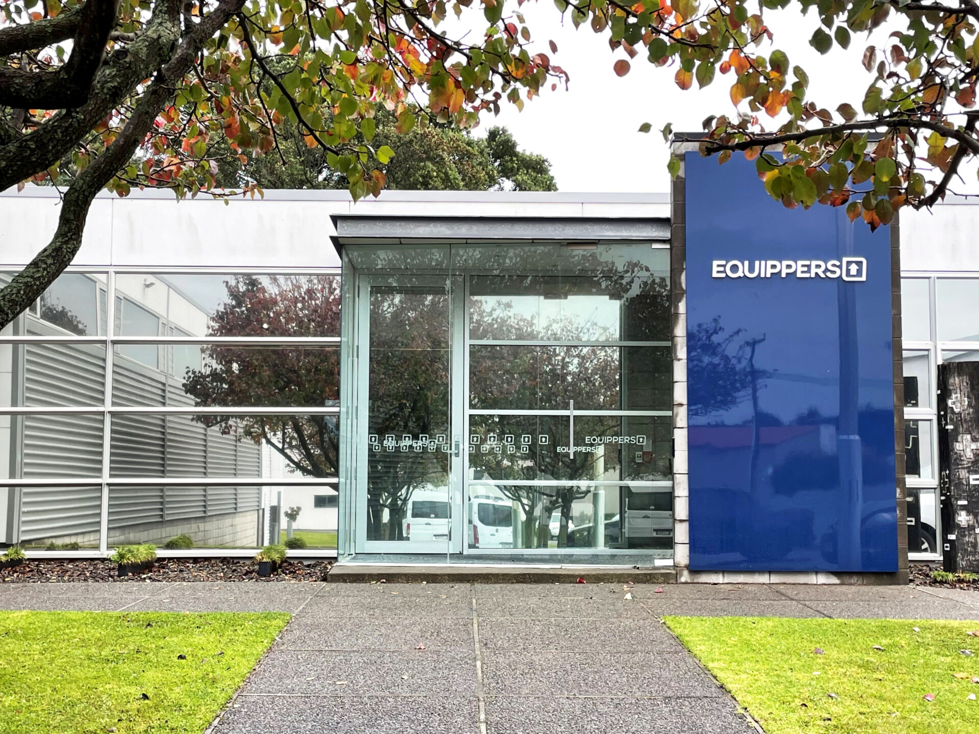
1. Building Frontage – Clean and Visible
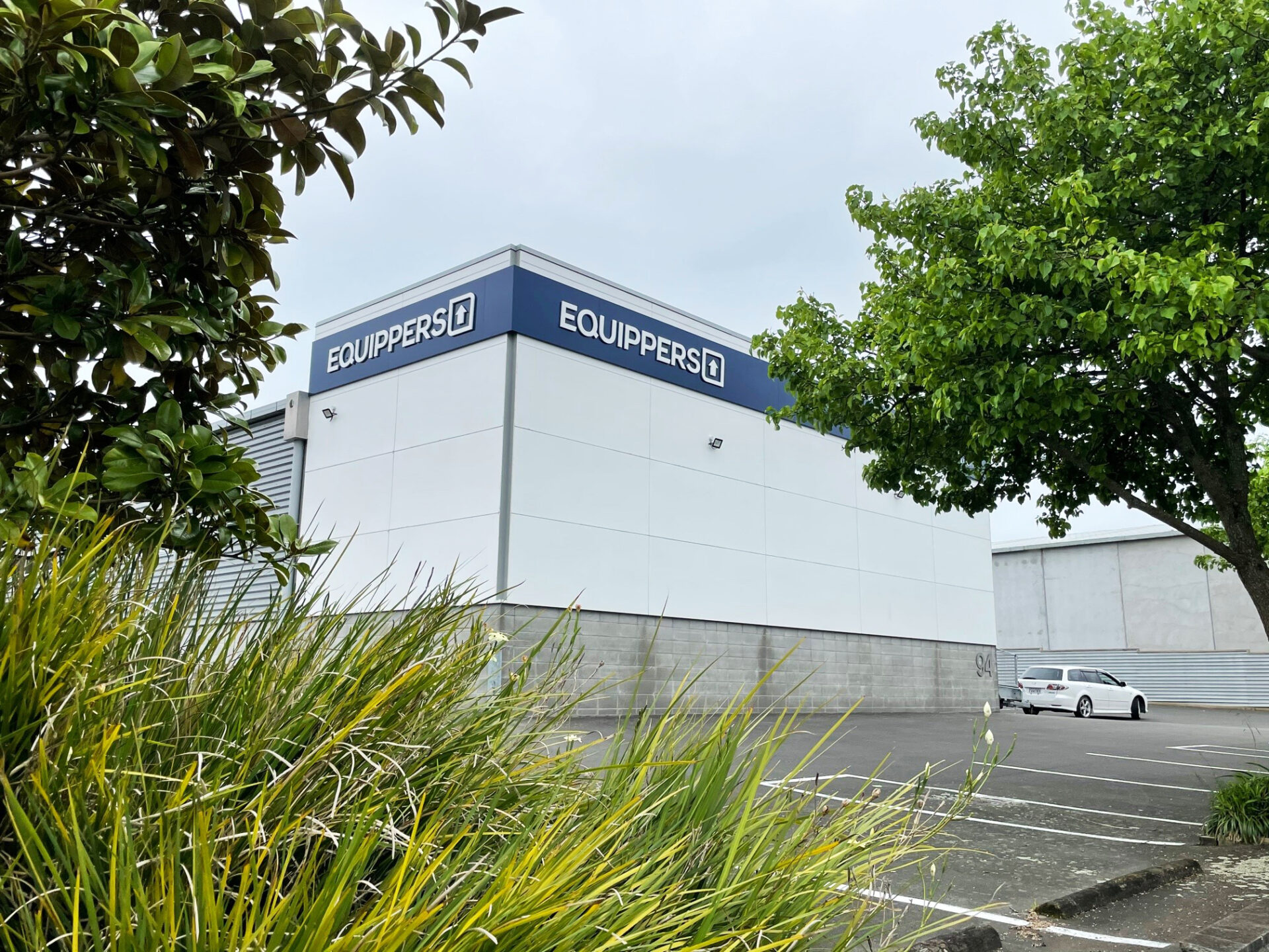
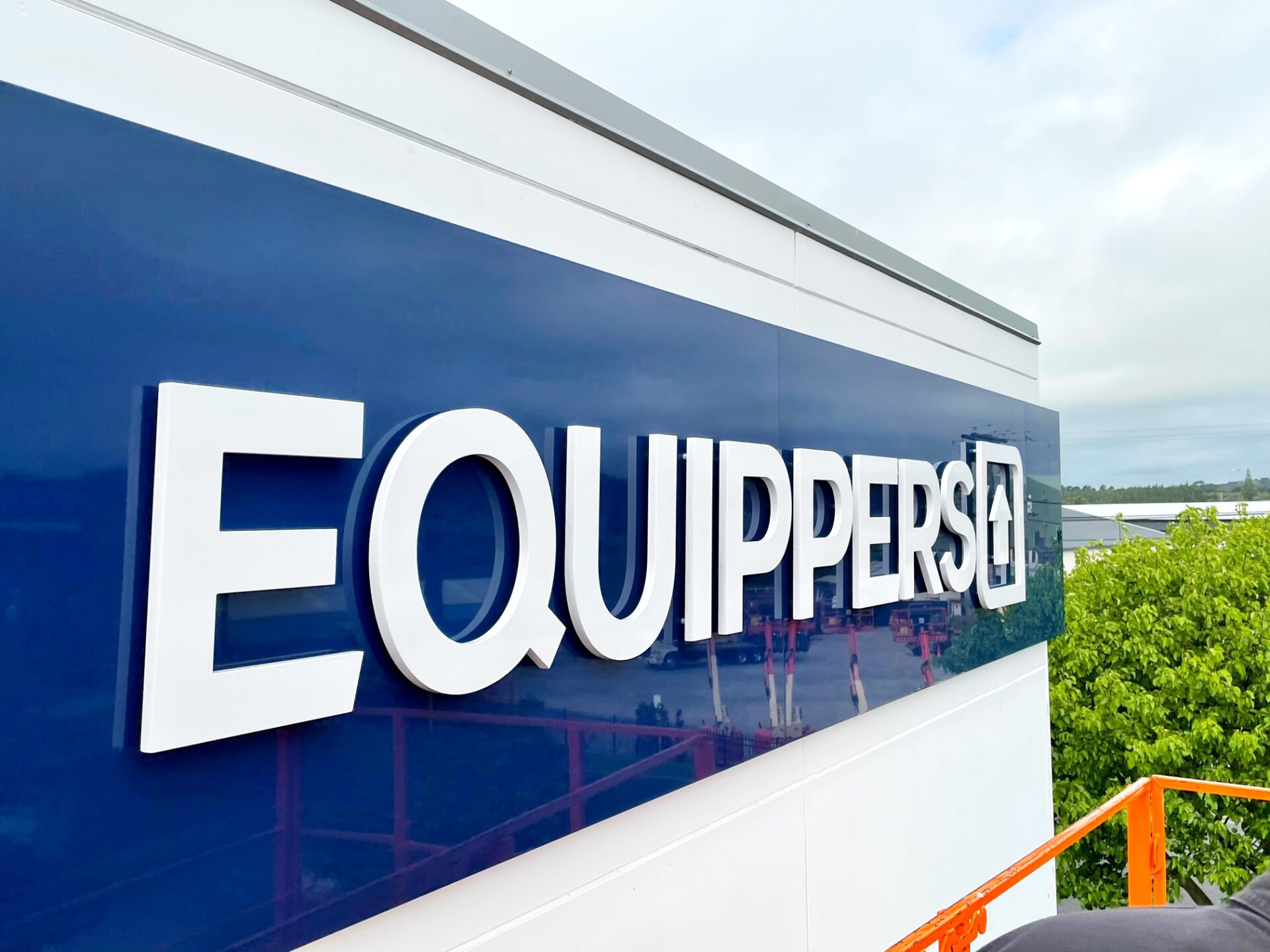
To make the church stand out on a street filled with commercial buildings, we designed a bold blue ACM band that wraps around the front and sides. This band made the building visible from three angles.
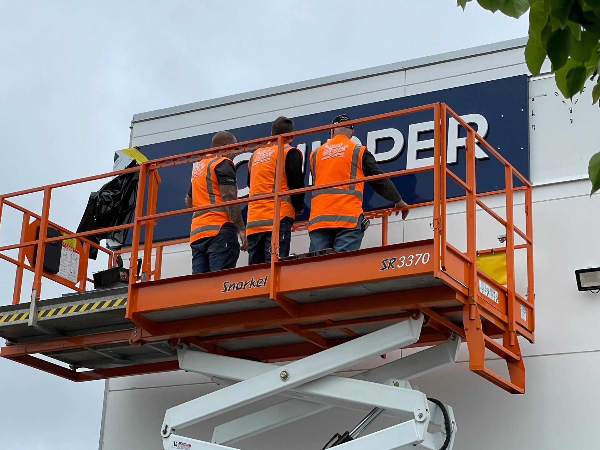
We matched Equippers’ Pantone colour to PSP’s dark blue ACM, then fabricated the signage using router-cut Foam PVC letters, spray-painted white. We pre-mounted the letters to ACM panels (or “cans”) and installed them quickly and cleanly onto aluminium rails. This efficient install method created a sharp, professional look without blowing the budget.
2. Entrance Sign – A Polished First Impression
The wall near the entrance was covered in holes from the previous tenant. To fix this, we installed a v-grooved ACM panel, folded and 2-pack sprayed to match the blue band out front.
We added the same 3D letters from the main sign to create a strong visual link between the building’s facade and its entryway. This brought consistency and a fresh, welcoming look for visitors.
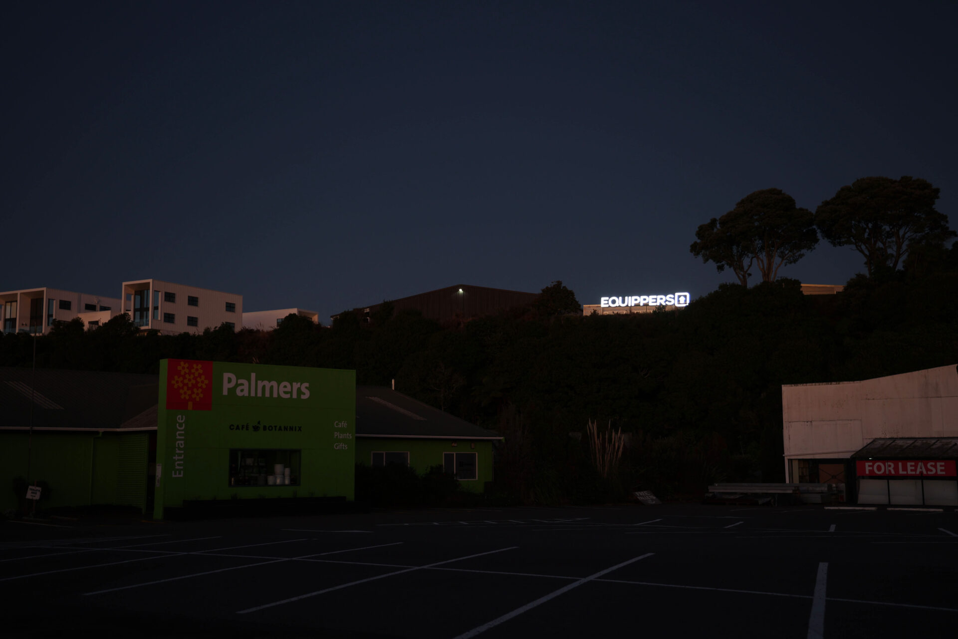
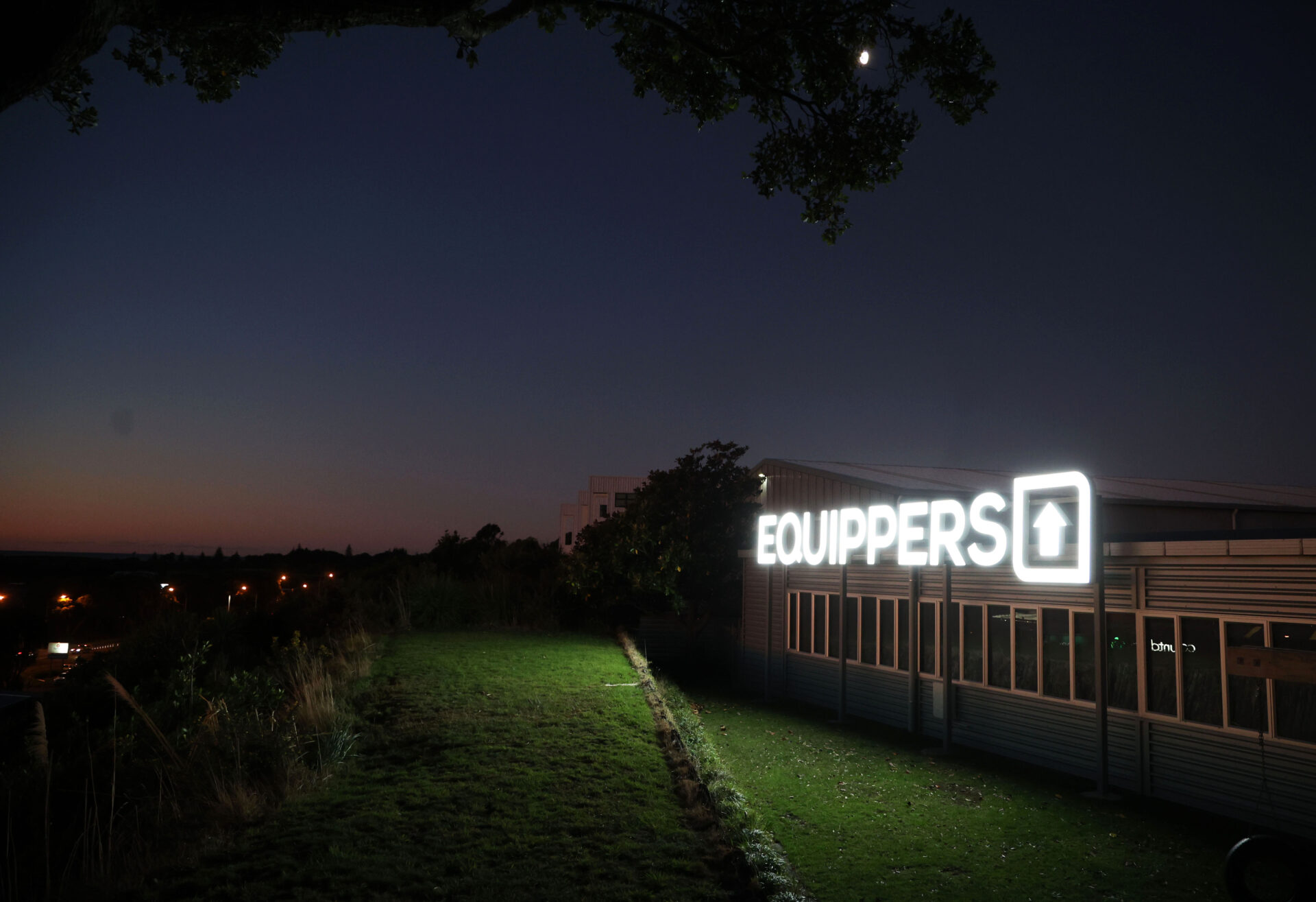
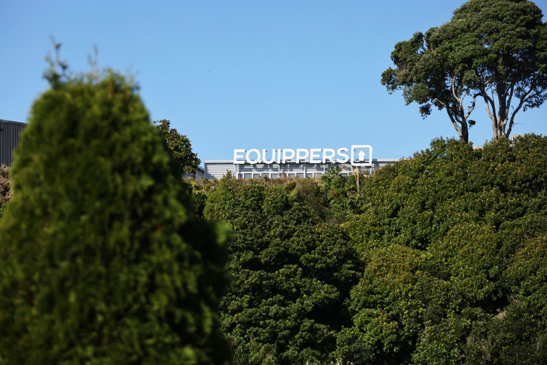
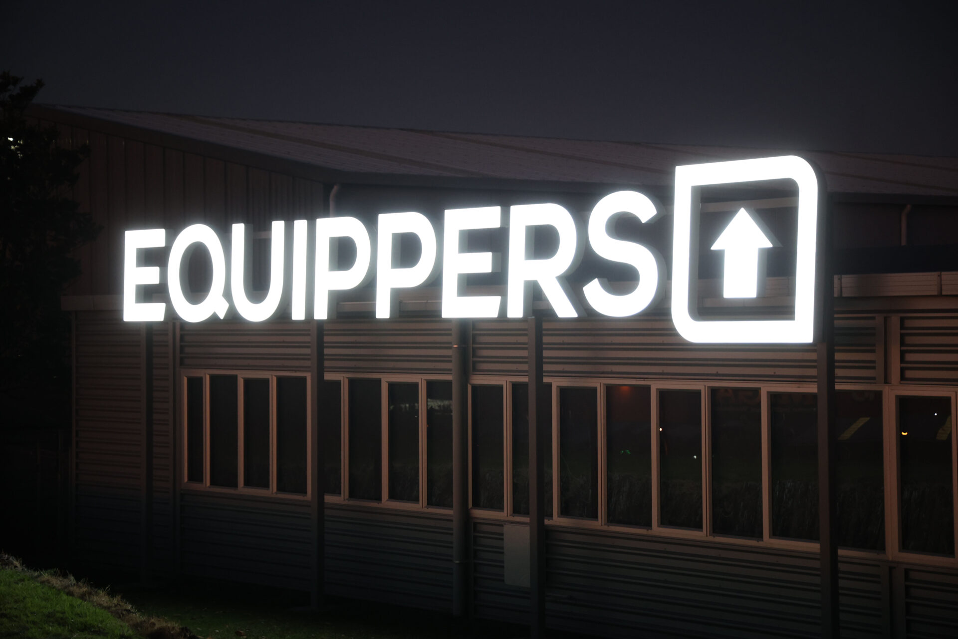
3. Illuminated Rear Sign – Highway Visibility Without Red Tape
The back of the building faces the motorway about 200 metres away. While elevated, the signage wouldn’t fall within a driver’s natural line of sight, so it needed to be big and bright—especially at night.
We looked into council permits, but the red tape and associated costs would’ve consumed most of the budget. Instead, we redesigned the sign to meet local regulations by keeping the total area under 12 square metres, placing it below the roofline, and removing the background panel.
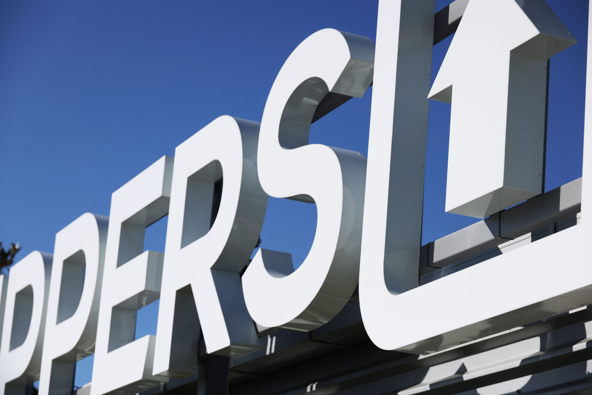
Working with a local planner, we confirmed we could measure each letter individually to stay under size limits. This approach allowed us to go as big as possible.
We built a custom steel frame with supports hidden behind the letters. The structure sits on four galvanised, colour-matched steel posts. We fabricated the letters using foam PVC backs, 1.2mm aluminium sides (2-pack sprayed white), and 6mm opal acrylic faces. Internal LED modules provide bright, consistent lighting. A ground-level control box houses the power supply and timer, making future maintenance easy.
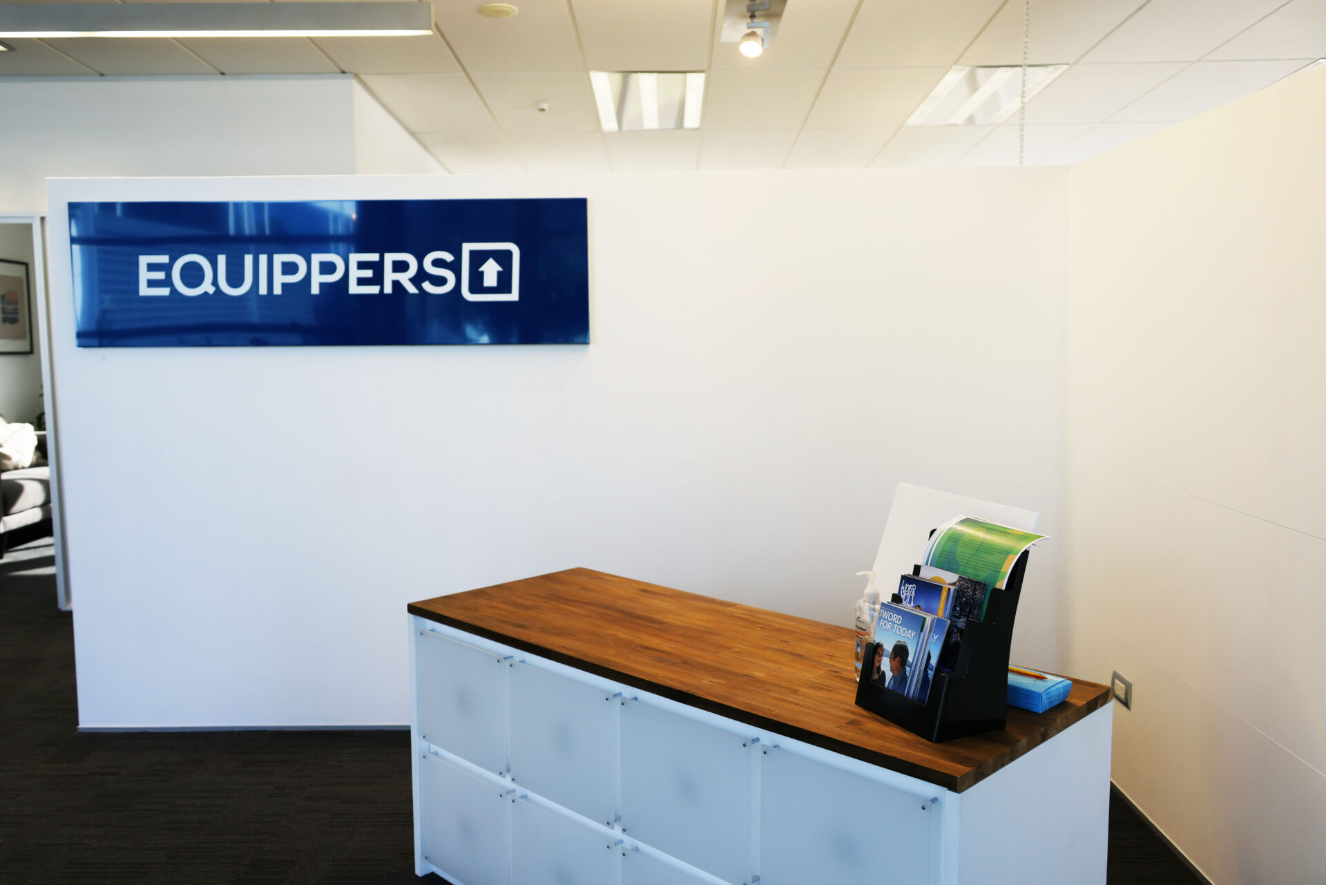
Final Touches – Stretching the Budget Further
To complete the project, we used offcuts from the building signage to create a small reception sign. We added laser-cut acrylic letters and included window manifestation markings featuring the Equippers arrow symbol to finish it all off.
The Result
The result is a striking, highly visible Equippers church signage solution that transforms an industrial space into a branded, welcoming place of worship. Our client was thrilled with the transformation, and we’re incredibly proud of the outcome. This project was also recognised as a FINALIST in the Corporate Brand – Interpretation and Delivery category at the 2021 NZ Sign & Display Awards, highlighting the quality and creativity of the work.
Custom Field
Lorem ipsum dolor sit amet
Date
20 November