Nitro Windscreens – Bold Branding That Breaks the Mold
Nitro Windscreens Van
Nitro Windscreens Van
Nitro Windscreens Van
Nitro Windscreens Van
Nitro Windscreens Van
Nitro Windscreens Van
About This Project
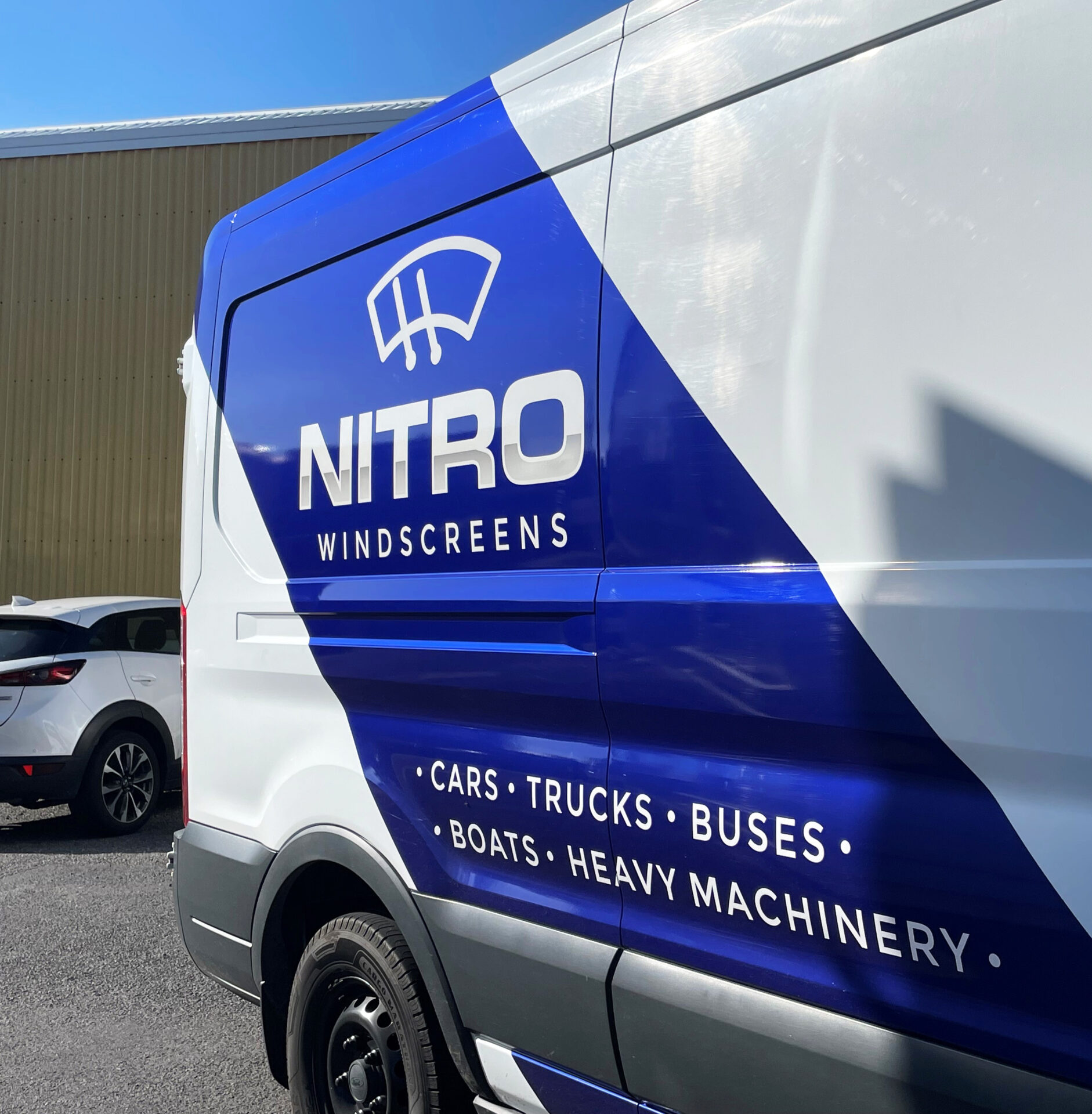
Nitro Windscreens came to us with a clear brief: “Make it bold, and totally different from my competitors.”
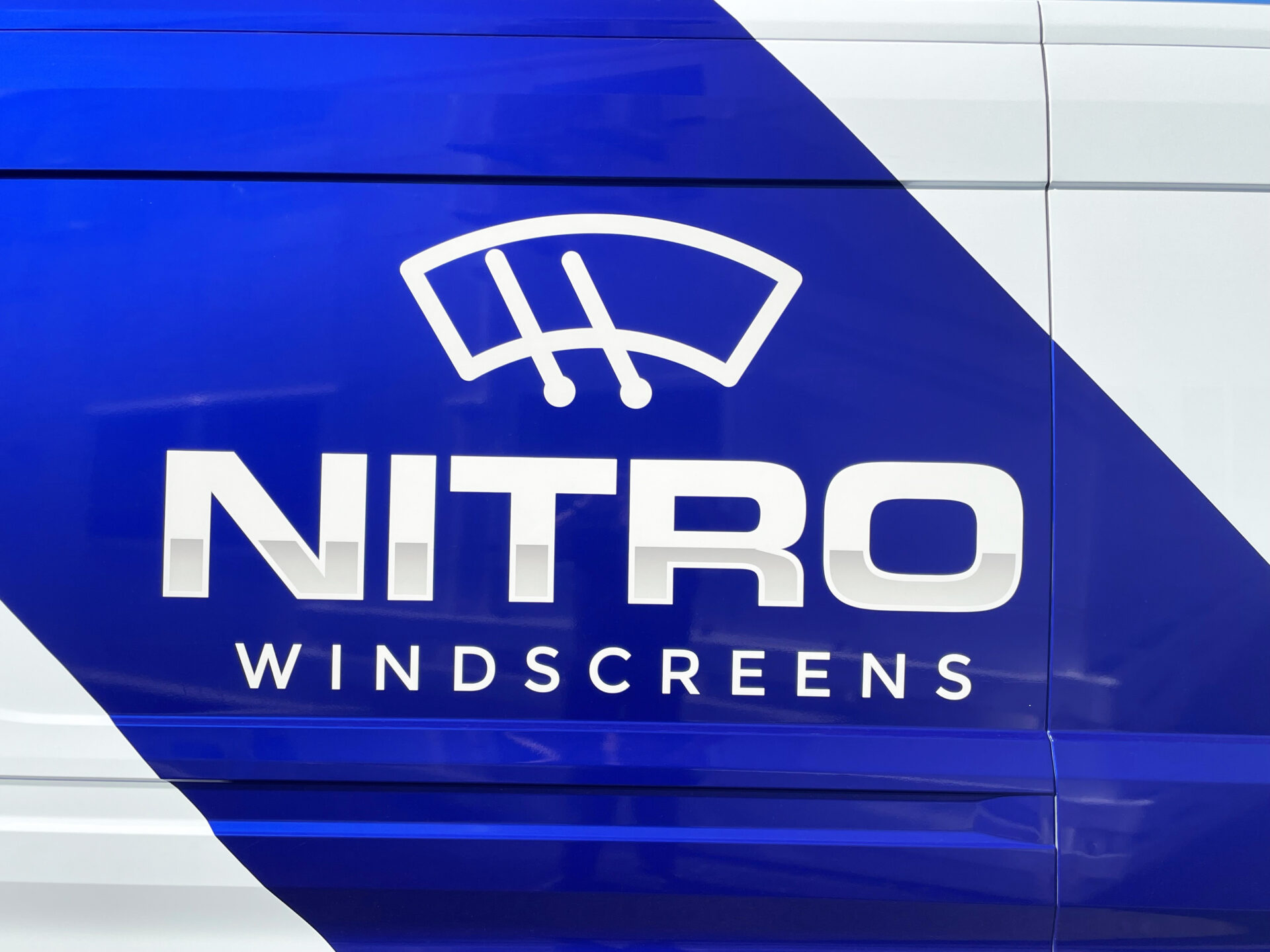
The client needed a logo and van signage for his new business. His biggest concern was standing out from local competitors like The Glass Man and Smith & Smith — both use green branding and similar fonts.
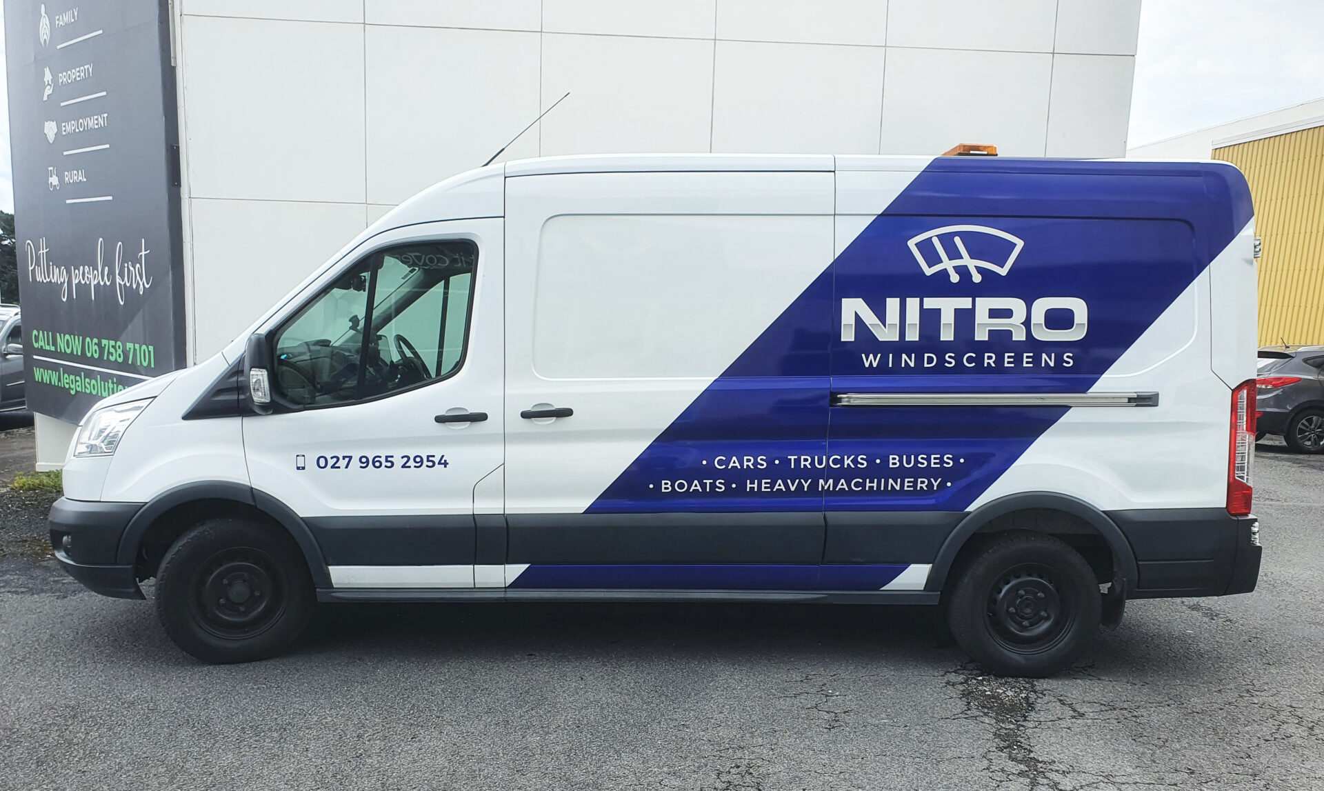
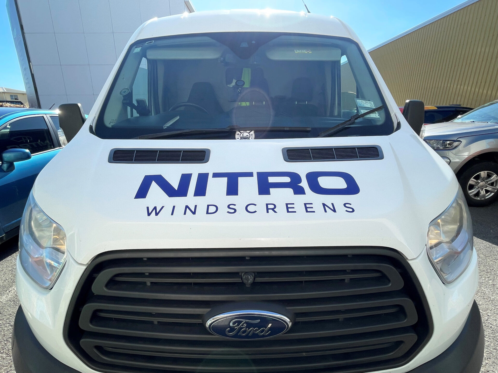
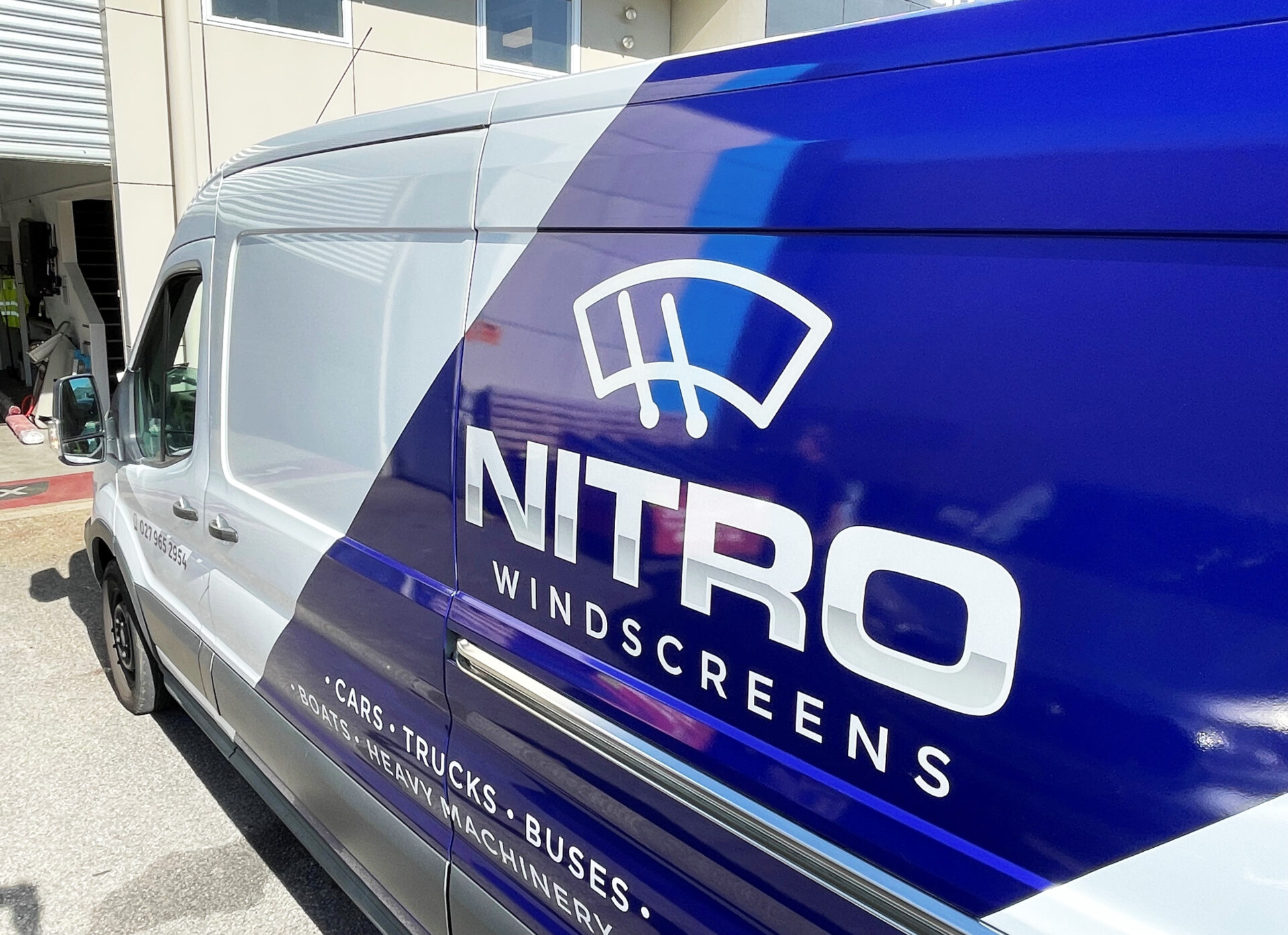
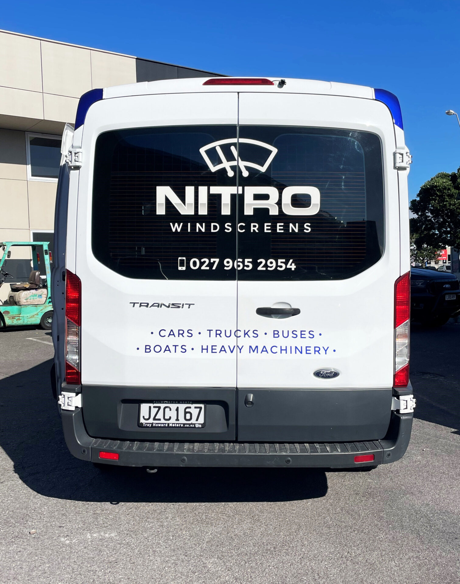
We created a clean, modern logo using bold, easy-to-read fonts. The custom symbol adds impact and helps reinforce the business name. In the word NITRO, we used subtle shading to suggest the reflection on a glass windscreen — a clever visual link to the service.
He instantly loved the result, especially the glossy metallic blue we chose for the brand. It’s energetic, fresh, and completely unlike his competitors.
While a full wrap wasn’t in the budget, we came up with a smart solution. We used a strip the width of the vinyl roll to deliver maximum effect, reduce waste, and stay within cost.
The end result is a van that looks sharp, feels premium, and turns heads. We’re now helping him expand the brand onto business cards and staff shirts.
Custom Field
Lorem ipsum dolor sit amet
Date
20 November